We have come quite a long way since last year, improving our style sheets organization, structure and reusability, thus we thought we could introduce our efforts so far. This is how we do CSS at Skroutz. Some facts:
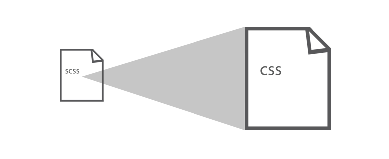
- we use the SASS preprocessor
- we use the Rails asset pipeline
- we have our own set of CSS guidelines
- we organize our files in a specific manner
- we use our own framework
- we gather core style sheets into bundles
- we import viewport specific partials
- we support all the major browsers back to IE8
- we monitor the most important metrics on an hourly basis
Some statistics about our current style sheets:
- There are a total 270+ SCSS files
- All of those files combined contain 32K+ lines of SCSS code
- There are 22 compiled CSS files
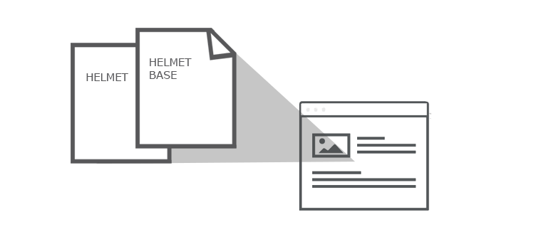
- The most crucial partials are Helmet_base and Helmet with a combined weight of 49KB gzipped and 3381 selectors
Helmet is a codename for our current version of Skroutz.
Skroutz is a large scale application thus it’s quite complex to create a sane way to manage files and bundle the correct style sheets whenever they are needed. So we follow some basic rules and techniques to keep our style sheets organized and structured.
1. Preprocessors
Since Skroutz is a Ruby on Rails application we are using the SASS preprocessor. While we are enthousiastic about the advanced features of SASS like @mixins, lists and loops we try to keep the codebase as simple as possible.
2. Asset pipeline
We are fans of the Rails Asset Pipeline. We don’t use sprockets to require CSS partials since we use SASS’s @import functionality to build up stylesheets. Although we use it to compile and minify our SCSS files on deployment.

3. Guidelines
We have our own set of guidelines (eg coding style, declaration order) that we try to follow closely and update as often as possible. You can have a look here: Skroutz CSS style guides.
4. File structure
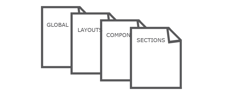
What we focused on in the last months was to create a file structure that would be easier to maintain and better organized. Our approach was a mixture from several popular file structures like SMACSS or ACSS with a touch of simplicity.
Skroutz SCSS file structure consist of 4 main parts/folders:
- Global
- Layouts
- Components
- Sections
####Global
The Global folder holds what we might call the boilerplate code for the project defining some standard styles for commonly used HTML elements. A Reset or Normalize is placed in our global folder.
####Layouts
The Layout folder contains everything that takes part in laying out the application. This folder could have style sheets for the main parts of the site like header, footer, navigation, sidebar etc.
####Components
The Components folder is more focused on ‘widgets’. It contains all kind of specific modules like a modal, a notification popup and basically anything along those lines.
####Sections
The Sections folder holds groups of styles according to specific sections
across application. If we have a group of styles for a particular section
we put them inside a grouped folder like account/ or users/ under the
Sections folder.

5. Skroutz Framework
Much of our core CSS comes from the Skroutz Framework, our internal CSS library. It’s a separate folder outside application styles so it can be used from our side applications too, like Skroutz for Merchants, Skroutz for Manufacturers or Skroutz blog. Framework consist of some basic styles for buttons, forms or reusable modules.
Specifically the Skroutz Framework consist of the following sections:
- Colors
- Fonts
- Variables
- Functions
- Grid
- Buttons
- State
- Forms
- Animations
- Modules
6. Bundles
Helmet_base and Helmet are our core bundles. Helmet base is cached across the entirety of Skroutz whereas Helmet is cached in some of the pages.
####Helmet base
Helmet base includes all the SCSS partials that are being used in every page, like global and layouts. It also includes component styles that we choose to load across the whole application, alongside with needed framework files.
// Import framework

@import "framework/variables";
@import "framework/functions";
@import "framework/colors";
@import "framework/fonts";
@import "framework/animation";
@import "framework/buttons";
@import "framework/forms";
@import "framework/state";
@import "framework/modules";
@import "framework/grid";


// Import global

@import "global/base";
@import "global/general";


// Import layouts

@import "layouts/layouts";
@import "layouts/sticky_bar";
@import "layouts/header";
@import "layouts/footer";


// Import components

@import "components/autocomplete";
@import "components/notifications";
@import "components/message_freak";
@import "components/favorites_popup";
@import "components/user_voice";
@import "components/modal_freak";
@import "components/notification_freak";
####Helmet
Helmet will include style sheets for Skroutz main pages like products listing, products page as well as some extra components which aren’t used often enough to be included in Helmet base (like lightbox etc). Helmet looks something like that:
// Import framework

@import "framework/variables";
@import "framework/functions";
@import "framework/colors";
@import "framework/fonts";
@import "framework/grid";


// Import layouts

@import "layouts/verticals";


// Import sections

@import "sections/index/products_index";
@import "sections/categories/products_search";
@import "sections/listing/products_list";
@import "sections/sku/sku";


// Import components

@import "components/lightbox";
@import "components/map_freak";
To avoid unused rules we load separate CSS partials for pages with unique styles. Even if we end up with an extra request the distribution of our page views makes this a much more efficient approach then simply counting network requests. For example, the product review page doesn’t need to load styles used in the account page or useless components, so we serve an extra CSS file.
We follow some basic rules for this approach like:
- 3-4 max requested CSS files per page.
- total CSS file size < 50KB (gzipped) per page.
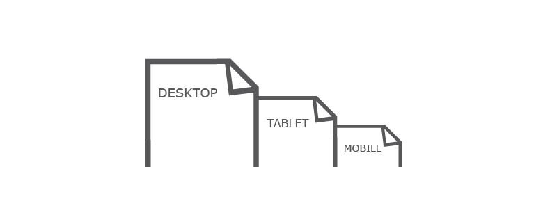
7. Responsive styles
Skroutz is a fully responsive application. We declare 2 breakpoints for three versions in our websites, 640px and 960px:
- Viewport < 640px (Mobile version)
- 641px < Viewport < 960px (Tablet version)
- 961px < Viewport (Desktop version)
The media queries suffixes we use to mark the SCSS file with breakpoint specific styles, are the following:
- _tablet.scss (Tablet version).
- _mobile.scss (Mobile version).
We also use media queries to distinguish between HiDPI displays (aka. Retina displays) and normal displays:
- _retina.scss (Retina version).
We don’t use inline/nested media queries to avoid bloated unmaintainable appearance of our SCSS files.
8. Browsers Compatibility
Skroutz supports all the major browsers back to IE8. For incompatible properties we use our prefix mixin to ensure the best browser support. We tend to experiment with no fully-supported CSS properties like flexbox but our main goal is to offer the same experience to all of our users across every browser.
IE Styles
We use Conditional comments to differentiate style sheets rules intended for specific versions of Internet Explorer.

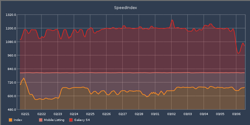
9. Monitoring
There are several important metrics that need to be monitored closely, like:
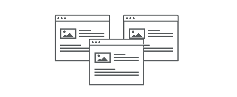
To keep an eye on them, we created a dashboard to display the above graphs for our most popular pages (Homepage, Product listing and Product page). We feed our graphs from Web page test.
The future
We are like to get rid of as much code as we can and we’re not dogmatic about keeping things around in case they might be needed. Refactoring is a part of our daily work though we do some occasional sprints with specific refactoring tasks. We have done some things but there is much more work to be done. Some of our future tasks will be:
- Replace custom prefix mixin with Autoprefixer.
- Εnriched our dashboard with more graphs (CSS file size changes total and per file, integration of CSSstats etc).
- Create ready to use framework themes.
- We are planning to revert media queries to mobile first approach in Skroutz next version since our traffic is over 30% from mobile devices.
- We are sceptical about SVG icons but since we still support IE8 we’ll stick with icon fonts.
Cheers if you made it to the bottom of this long post.
Skroutz CSS Team (Katsampu, Grigoria, Vangeltzo and Nemlah).