At Skroutz, we aspire to provide the most intuitive and hassle-free user experience. As a result, we constantly iterate over interface elements, redesigning, polishing and tailoring them to users’ needs. One such iteration was the recent redesign of the image gallery on fashion pages.
The aim of the redesign was to provide a more premium user experience on fashion categories. We opted to increase the main image size, as such categories are mainly image-driven, while also making image browsing easier and faster via scroll and thumbnail interactions. Additionally, we redesigned the image preview modal on desktop to better cater to user needs.
Implementation details
Before we go any further, it’s worth explaining how the component works from a technical standpoint. Without getting into too much detail, here’s a quick overview of the scrollable gallery area implementation:
- The outer container layer,
.slides-container, has a 3:4 aspect ratio which locks it into a fixed size. This is done to ensure fashion images which are always cropped to this ratio are displayed correctly. - The inner container layer,
.slides, fits the outer container and usesoverflow-y: autoto be vertically scrollable. It also usesscroll-snap-type: y mandatoryto create a snapping behavior on scroll. - Inside the inner container, there are multiple
.slideelements. Each one is sized to fill the area and has ascroll-snap-align: startproperty to ensure that it snaps to the top of the container.
There are also various other implementation details that come into play, such as JavaScript event handling, updating component state, highlighting the current slide thumbnail and so on.
The problem
After implementing and deploying the new design, we received internal reports about the gallery not responding correctly to certain user interactions. Specifically, some users reported that touchpad scrolling would lock the page to the gallery after reaching the end of the gallery slides. This would effectively prevent users from scrolling down the rest of the page until they scrolled up again. Here’s what this looked like in action:
An in-depth investigation
Bug reports aren’t always clear or easy to reproduce. In this case, we had some difficulty tracking down the issue. We finally managed to pinpoint it to touchpads and, more specifically, to their inertial scrolling behavior. Due to the nature of this behavior, OS and browser made a huge difference in reproducing it. This only made it harder to track down and understand the inner workings of the problem. From what we know now, MacOS touchpad inertia was the main culprit.
After realizing the behavioral cause, we had to understand the technical one, too. After some investigation, it seemed like scroll-snap-type: y mandatory was to blame. There are various conflicting reports of bugs with this property on MacOS related to inertia on different browsers and OS versions. The bottom line is that the mandatory part can cause certain problems under the right circumstances.
Oddly enough, using plain scroll-snap-type: y worked correctly and didn’t cause any bugs, but the behavior wasn’t the desired one. As expected, the scroll position would only snap at certain parts of the image instead of always. At this point, we thought we could use the :hover pseudo-selector to make snapping mandatory only when the mouse was inside the gallery container. While this CSS-only approach made sense on paper, it started to cause some very unexpected issues.
Clearly, this approach didn’t work as well as we’d hoped. However, it pushed us closer to a solution. After all, using :hover was a straightforward way to detect if the user was indeed intent on scrolling the gallery or the entire page. Thus, we could disable the vertical scroll (overflow-y: hidden) when the gallery wasn’t hovered. This was far more stable, but would cause gallery slides to get stuck halfway through being scrolled if the cursor exited the gallery container.
The next step towards a solution was to add some JavaScript. A simple 300ms interval that would check for the container being hovered and snapping the slide into position should solve the problem, we thought. And it worked for the most part. However, the user experience didn’t feel great.
There was a little bit of a visual stutter involved, which we weren’t pleased with. After all, great care was put into making the gallery scroll experience feel smooth and premium. So, we had to deal with this stutter by using some sort of transition.
Unfortunately, overflow is a binary CSS property and, much like display, cannot be transitioned. The CSS engine has no clue what such a transition would look like. Fortunately, CSS animations can be leveraged for this kind of thing. By creating an animation with a from { overflow: auto; } keyframe, we can make it so that the stutter is less pronounced.
By now, the average reader wouldn’t expect this to work without a hitch. And, like clockwork, it did not. While the animation worked, it required about 600ms to feel smooth. This would lock the page scroll for a little too long and the user would feel like the page was unresponsive.
Luckily, the animation timing highlighted a potential solution. By slowing down the start of the animation and speeding it up towards the end, we could simulate an inertial snap. After some tinkering, we ended up with a cubic-bezier(.35, -.7, 1, 1) timing function.
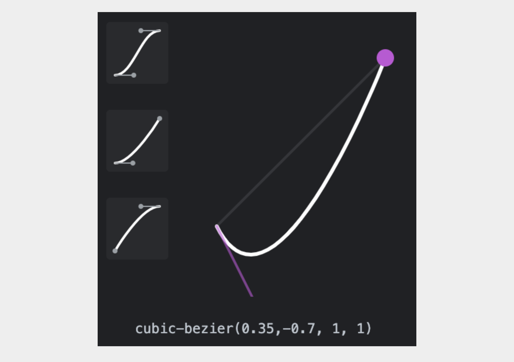
This timing function enabled us to shorten the animation duration back to 300ms, matching the snap interval. This was the last piece in this puzzle. While the inertial snap isn’t perfect, it’s far less noticeable and the page doesn’t lock anymore when the user reaches the last slide.
Putting it all together, we had to make the following changes to the gallery component:
- Set an interval that runs every 300ms from the gallery component. Whenever it’s run it checks if the
.slideselement is still hovered. If it isn’t, it snaps it to the correct gallery slide. - Use the
:hoverCSS pseudo-selector to changeoverflow-ybehavior in the.slideselement, effectively preventing scroll events from occurring in the gallery when the mouse is not over it. This prevents the scroll from getting locked when the user reaches the end of the gallery with inertial scroll. - Define a CSS animation for the
overflowproperty that animates the transition from hovered to not hovered on the.slideselement. An appropriate timing function effectively produces an inertia-like transition while the JavaScript-based slide snapping happens.
Here’s a CodePen with the final gallery implementation. Note that internal implementation details have been omitted, as they’re unrelated to this example.
Impact on user experience
After fixing the bug, we took a look at the numbers to see the potential impact on user experience. On surface, this was a localized issue, that would only affect certain users on very specific conditions. As it turns out, that wasn’t exactly the case. While only a small fraction of sessions (roughly 2%), about 500.000 monthly Skroutz users are on the appropriate OS and browser combination to experience this bug. This means that, even though the percentage is small, the absolute number of users that could end up on an almost unusable page was still pretty high. This goes to show that even small, localized bugs, can spiral into a lot of user frustration, if left unaddressed.