What’s the excitement about one screen being the ultimate solution? Presenting the new Listing Screen, an update to the legacy version that now supports sections, ready to transform how we manage listings in our app. The Home Screen of the Android Skroutz app already uses sections, setting the stage for a dynamic user experience. This article will explore the challenges we encountered during the implementation process, the solutions we developed, and how we successfully executed a smooth release.
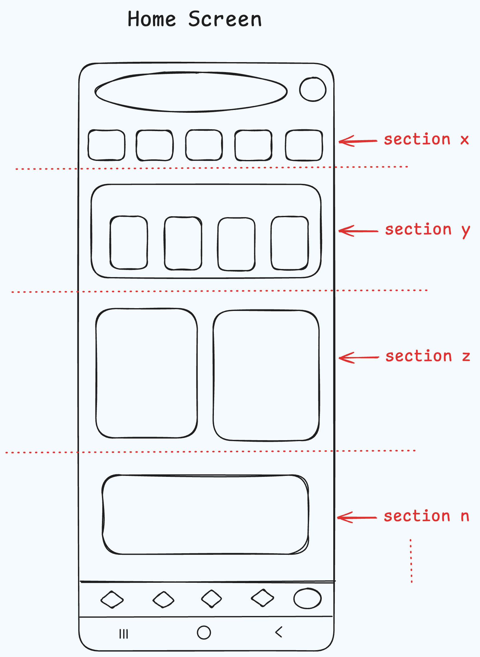
So, what exactly are these sections, and why are they so crucial?
Stacking the UI Like Legos.
A section acts as the foundational unit within the API-Client architecture, serving as a structural element that organizes the user interface into distinct components. Each section contains its own set of items, allowing for a modular and flexible approach to UI design. This setup supports a server-driven model, where UI updates can be managed remotely, minimizing the need for release updates to fix UI-related bugs. Sections are dynamic, offering customizable elements like background colors for light and dark themes, icons that adjust to different modes, dynamic text, and navigation behaviors. Think of sections like Lego™ blocks: easy to add, remove, or rearrange, enabling quick adjustments without disrupting the app’s release cycle, while ensuring a consistent experience across platforms.
Legacy Code: A Necessary Evil
Every project has its share of legacy code, and ours is no exception. The old Listing Screen, written in Java, has become a big challenge as the rest of the project has moved to Kotlin. With over 7,000 lines of code across abstract classes and complex implementations, it’s now hard to manage. The Listing Screen was responsible for loading SKUs (Stock Keeping Units) and header elements, dividing the screen into a header section and a vertical list. It supported pagination, automatically loading additional SKUs as the user scrolled. To accommodate low-end Android devices, a caching system was used to store the last four pages in memory. However, this system had a significant flaw. It was designed to work only with a fixed page size of 24 items, and when fewer results were loaded, the cache would artificially pad the list with dummy data to reach the required count. This code is a classic example of a “broken window”, contributing heavily to our technical debt. Building on top of it was no longer an option. We needed a clean start to move forward efficiently.
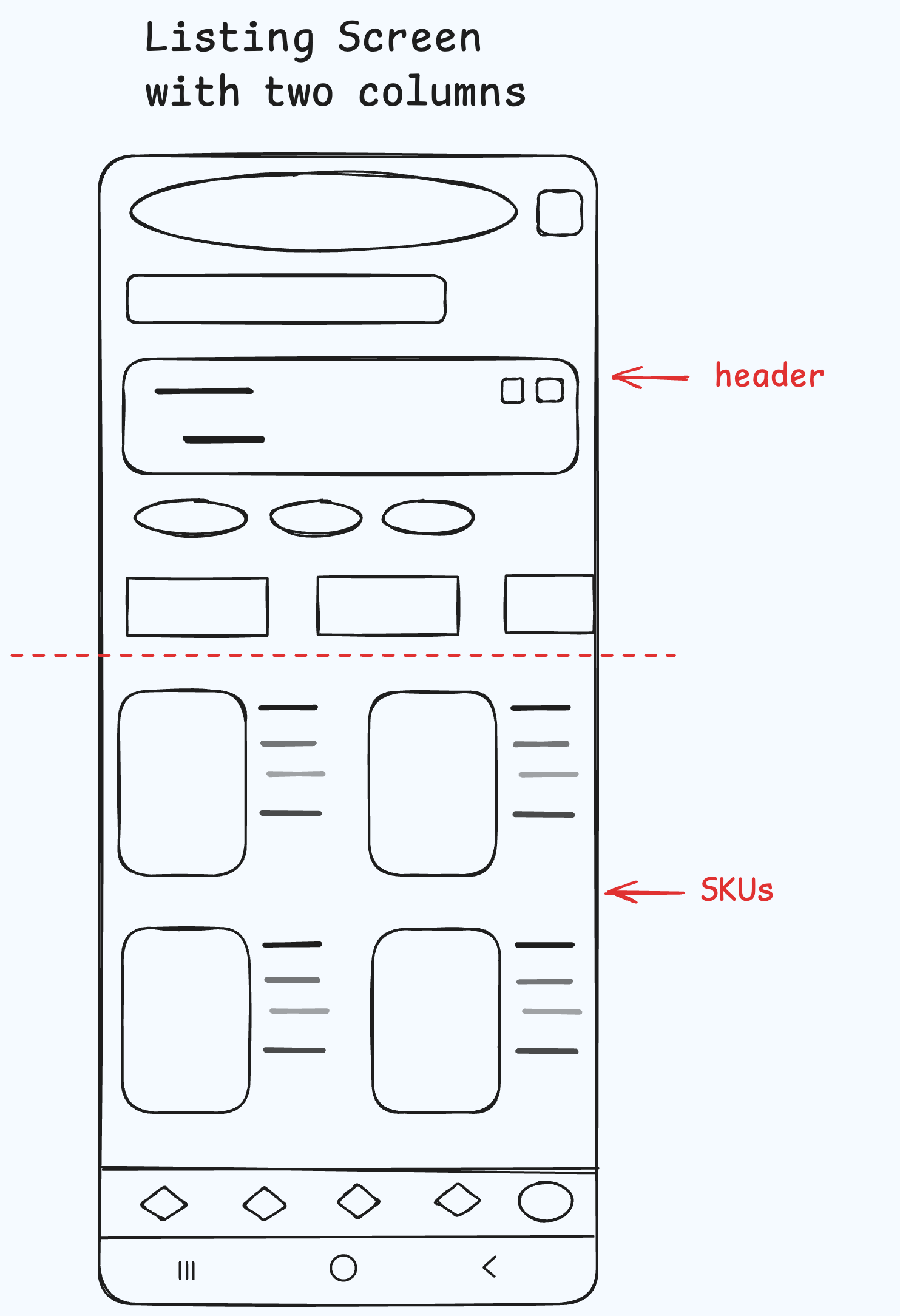
Bye-Bye, Legacy: The Next Generation of Listing Screens
So, why did we decide to create a new Listing Screen from scratch? The answer lies in our commitment to investing in the future. By adopting a modular, section-based approach, we ensure that future updates will be faster and easier to implement. Any member of the Android team can add new sections with minimal effort while reusing existing ones. To achieve this, we built the new Listing Screen in Kotlin, applying established design patterns to maintain quality. Our first step was to understand the legacy screen’s code and the business decisions that shaped it, ensuring we could migrate them without introducing issues. This was no easy task; the Listing Screen is critical, supporting essential app functions like search results, offers, groceries, and favorites. The complexity and numerous workarounds made it a significant challenge. To manage the migration effectively, we broke it down into smaller tasks, utilizing a main branch and opening Pull Requests (PRs) over that branch.
A Circular Buffer Approach to Caching Pages
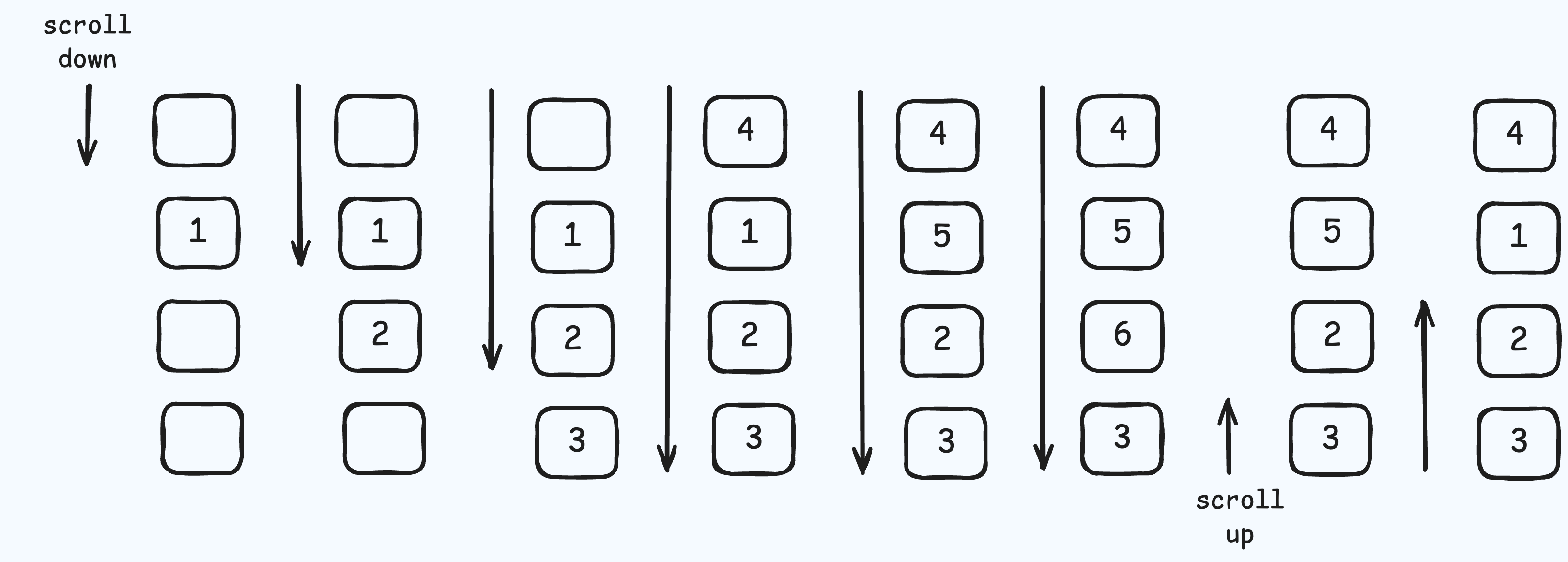
We developed a custom caching system to store the last four pages of the listing. At the core of this cache is an array, which functions as a circular buffer. Each element in the array corresponds to a page, storing its results. As users scroll through the listing, pages are dynamically added and removed, ensuring that only the most recent four pages are kept in memory.
Why an Array? We chose an array-based circular buffer for several key reasons:
-
Performance: Arrays offer constant-time O(1) access to elements, allowing quick read and write operations.
-
Memory Efficiency: Since arrays have a fixed size, memory management becomes simpler, with no need for resizing or reallocating memory during runtime.
-
Cache Coherence: Arrays promote better data locality, keeping related data close together in memory. This enhances CPU cache efficiency due to spatial locality, allowing faster access to nearby elements.
-
Simplicity: While more complex data structures like linked lists or trees offer flexibility, they introduce overhead in both memory usage and performance. Linked lists, for instance, require additional pointers, and operations such as element access can become costly due to traversal. Trees, on the other hand, add complexity in balancing and maintaining properties, along with node and pointer overhead that can slow operations.
Here’s a look at our implementation:
/**
 * A circular buffer implementation that maps integer keys to values.
 *
 * This class stores a limited number of entries (maxSize) and automatically manages
 * the keys to ensure that only the most recent entries are retained.
 *
 * @param V the type of values stored in the buffer
 * @property maxSize the maximum number of entries the buffer can hold
 */
  class CircularBufferMap<V>(private val maxSize: Int) {

    init {
      require(maxSize > 0) { "Invalid max size specified: $maxSize" }
    }

    private val buffer = arrayOfNulls<Any?>(maxSize)

    var minKey = INVALID_KEY
      private set
    var maxKey = INVALID_KEY
      private set

    /**
     * Checks if the buffer is empty.
     */
    val isEmpty: Boolean
      get() = size == 0

    /**
     * Returns the number of entries currently stored in the buffer.
     */
    val size: Int
      get() = if (minKey == INVALID_KEY || maxKey == INVALID_KEY) 0 else maxKey - minKey + 1

    /**
     * Retrieves the value associated with the given key.
     *
     * @param key the key to retrieve the value for
     * @return the value associated with the key, or null if not found
     */
    operator fun get(key: Int): V? = if (key < minKey || key > maxKey) null else buffer[getIndex(key)] as V?

    /**
     * Adds a value to the buffer with the specified key.
     *
     * @param key the key to associate with the value
     * @param value the value to be added
     */
    fun add(
     key: Int,
     value: V
    ) {
      require(key >= 0) { "Key must be non-negative: $key" }

      require(isKeyInRange(key)) {
        "Attempted to insert a value with a non-sequential key: $key - Current key range: $minKey - $maxKey"
      }

      buffer[getIndex(key)] = value

      when {
        minKey == INVALID_KEY || maxKey == INVALID_KEY -> {
        minKey = key
        maxKey = key
      }

      key > maxKey -> {
        maxKey = key
        if (size > maxSize) minKey++
      }

      key < minKey -> {
        minKey = key
        if (size > maxSize) maxKey--
      }
    }
  }

 /**
  * Clears all entries from the buffer.
  */
  fun clear() {
    buffer.fill(null)
    minKey = INVALID_KEY
    maxKey = INVALID_KEY
  }

   /**
   * Checks if the buffer contains the specified key.
   *
   * @param key the key to check for
   * @return true if the key is present, false otherwise
   */
   fun containsKey(key: Int): Boolean = key in minKey..maxKey

  /**
   * Returns a snapshot of the current entries in the buffer as a map.
   *
   * @return a map containing the current key-value pairs in the buffer
   */
    fun snapshot(): Map<Int, V?> {
      val snapshot = mutableMapOf<Int, V?>()
      if (minKey != INVALID_KEY && maxKey != INVALID_KEY) {
        for (i in minKey..maxKey) {
          snapshot[i] = get(i)
        }
      }
      return snapshot
    }

    private fun isKeyInRange(key: Int): Boolean = isEmpty || key in (minKey - 1)..(maxKey + 1)

    private fun getIndex(key: Int): Int = key % maxSize

    companion object {
       const val INVALID_KEY = -1
    }
  }
This diagram illustrates how the CircularBufferMap works, showcasing the structure and functionality of the circular buffer implementation.
Nested RecyclerViews: A Battle of Scrolls
The new listing screen brought us a significant challenge: managing nested vertical lists. Using vertically nested
RecyclerViews can introduce several issues that negatively impact performance and user experience.
-
First, there’s the problem of measurement. When the inner
RecyclerViewwraps its content, the system must measure its height every time a new item in the outer list is loaded. This constant re-measuring can slow things down considerably, especially if the inner list contains many items. It’s like trying to measure a box every time you put something inside—not the most efficient approach. -
Next, there are performance issues. When you nest vertical
RecyclerViews, the outer one struggles to manage scroll behavior effectively. This can lead to sluggish, jerky scrolling, as both the outer and inner views compete to handle scroll events. To fix the measurement issue, one solution is to set a specific height for the innerRecyclerView. However, this can create new problems. For instance, the outerRecyclerViewmay inadvertently intercept scroll actions meant for the innerRecyclerView, resulting in unpredictable or even broken scrolling. Imagine trying to scroll through a list inside another list, only for the outer one to take control—super frustrating! To show these issues, take a look at the videos below. In the first one, the outerRecyclerViewintercepts scrolls, while in the second, the innerRecyclerViewtakes over. Both examples highlight the scrolling problems we’re dealing with.
Outer RecyclerView Scrolls
Inner RecyclerView Scrolls
Restructuring for Success: When life gives you nested lists, make them horizontal!
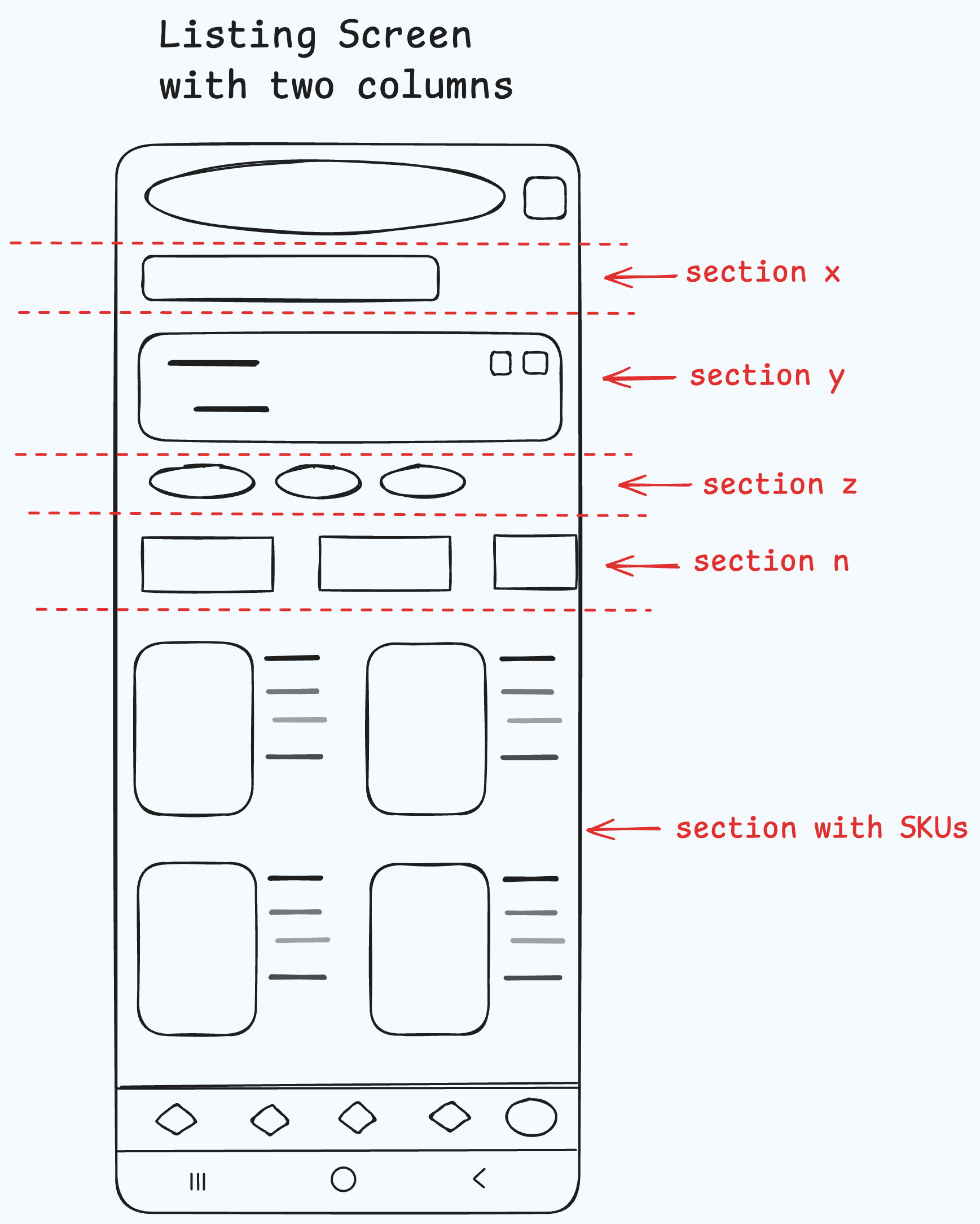
To solve the scrolling problems caused by nested RecyclerViews, we decided to change the vertical grid layout into
multiple horizontal lists that share a
RecyclerViewPool.
This setup is ideal for situations where several lists rely on the same view holders, and by converting the vertical grid into horizontal lists we unlocked several key advantages:
- Sharing a RecyclerViewPool enables multiple horizontal lists to efficiently recycle views, which lowers memory consumption and boosts performance, especially during rapid scrolling.
- This smooth reuse of views minimizes stuttering, ensuring they are readily available when needed.
- Finally, horizontal lists allow each list to manage its own content without the complications of nested scrolling. This makes it easier for users to interact with the entire screen.
Here’s a simple function to split a section’s items into multiple horizontal lists:
internal fun Section.splitSectionItems(numberOfColumns: Int): List<Section> {
  val subLists = items.chunked(numberOfColumns)
  return subLists.map { sublist ->
    this.copy(items = sublist)
  }
}
And here’s the result:
Testing the Waters: Rolling Out the Listing Screen
The listing screen is a critical part of our app, so we knew we couldn’t just release it all at once. Instead, we followed a carefully planned release strategy. We began with internal User Acceptance Testing (UAT) and added a classic flag on the API to easily differentiate between the old and new screens. Our first live test focused on the laptops category, helping us identify early bugs or crashes while keeping the rest of the platform unaffected. By starting small, we could safely monitor the release, with the option to roll back if needed. Once things were stable, we extended the new listing screen to all categories for Skroutz employees, gathering feedback and addressing any remaining issues. We’re looking forward to the day when the legacy listing screen is gone for good, leaving behind a better experience for all our users.
One Screen to Rule Them All? Well, Almost
The new Listing Screen outperforms the legacy one in both memory and CPU usage. Most of the adapters utilized in this new Listing Screen are already in Jetpack Compose, and we plan to update all adapters to Jetpack Compose soon, further enhancing our app’s performance. With a solid foundation, as it is 100% unit tested and follows the (Model View Intent) MVI approach, this screen sets the standard for how we’ll organize and deliver content across the app. Sections are already powering the profile, categories, and home screens, and this screen is designed to bring everything together. The potential is obvious: this screen could eventually replace others, becoming the go-to solution for managing content throughout the app.
The header image of this article was generated by AI, and all graphs were created using excalidraw.com.
