Last month (on October 25 and 26), we* attended the Smashing Conference in Barcelona, a conference with a broad focus in web design and development.
The Smashing Conference, organized by the Smashing Magazine’s team, was held in the Palau de la Música Catalana.
Here are our notes from it.
Short version
Most talks were interesting and quite inspiring.
Marcin Wichary, a designer at Medium.com talked about the importance of typography, and to which degree one can optimize this aspect of a product. If you are details-obsessed this is a must see (video).
Modern web has a lot of motion nowadays, so animation expert Val Head presented her view of how this motion on the web should be.
Maybe you have heard about design systems (if not, you can read our approach here) which are emerging as a new trend in web design / development. What you might not know is that there is a bidirectional relationship of the design systems and the details. Stephen Hay, UX Design Lead at Catawiki, talked about this relationship and how looking at the small parts of design can add up to a meaningful experience. Since “our” ex-collegue and friend Fotos moves this kind of rocks at Catawiki, we enjoyed this talk pretty much! :)
In order to move the web forward, there is a keyword that all developers and designers should embrace - resilience. This was also the title of Jeremy Keith’s talk, where he pointed out a three-step approach for building on the web: a. Identify the core functionality, b. Make that functionality available using the simplest technology, c. Enhance.
Jonathan Snook, interestingly introduced us to his thoughts about Container Queries, that is the ability to apply styles based on the space the components occupy, rather than the size of the viewport. We enjoyed the talk, since we have implemented an internal scss mixin for that purpose as well.
Jen Simmons is a designer and developer advocate at Mozilla. She talked about the available technologies for creating amazing things on the web. Did you know that CSS Grid Layout will be about 70% supported in spring 2017?
Finally, Christian Holst from Baymard Institute shared practical insights for c/r optimization in eCommerce.
Other speakers were also pretty good!
Barcelona on the other hand is a great city! We had an excellent time there and enjoyed our trip very much. Everything was perfect. Ah, I should not forget to mention that we took an up-close look at 5 UEFA Champions League cups (see photos in the end of the post)!
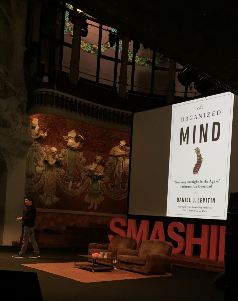 Stephen Hay talks about the importance of details in web design.
Full version
Marcin Wichary talked about typography
If someone would challenge me to style a webpage by using only one CSS property, I would definitely choose the font property.
“Typography is the art and technique of arranging type to make written language legible, readable, and appealing when displayed.”
- Wikipedia
Typography is the connective line between the old and the new dots. Typography is superb. Typography is great. End.
Would you ever think that “quoting” or “underlining” a text in a webpage will be a developer’s strongest problem? Me neither. So if you think that little things and details make big things happen, go ahead, see Marcin’s talk here.
Val Head talked about motion
Ignoring motion design is a common case for web designers that have no such background and Val Head addressed how we come up with animations that are unintuitive and boring.
Fortunately, there are things we can do to improve motion we apply to elements of our webpages. One of the first references we were shown, were the 12 principles of animation. For example, “Timing and Spacing” makes animated objects appear to obey the laws of physics and establishes mood, emotion and reaction. Or, “Follow through” makes the ending of motion feel more natural as not everything comes to a stop at once.
Starting from a very basic animation, we applied the aforementioned principles (Timing and Spacing, Follow Through) and ended up with a much more natural, and complete animation, like the one follows:
See the Pen net magazine demo - Complete by Aggelos Bakos (@aggelosb) on CodePen.
Stephen Hay talked about details in design systems
Many speakers of the conference pinpointed the general “sameness” we are facing on today’s websites. Stephen Hay was one of them and really did a great job on showing us examples of unique art direction for the web. He mentioned how some modern design systems (like atomic design) are leading us to a structured way of seeing websites as parts of smaller components.
“We’re not designing pages, we’re designing systems of components.”
-Stephen Hay
He referred to the concept of a design funnel, which is basically his perspective of how the design process should look like. In addition, he explained how the lack of design foundation and critical thinking, results in skipping the first three levels of the design funnel and as a result, we end up facing our design challenges with design solutions others came up with, for different problems than ours.
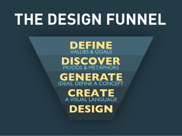 Stephen’s Hay design funnel.
Jen Simmons on revolutionize your page
It is in people’s nature to constantly evolve and morph - consequently this is also design’s destiny. Surprisingly nowadays this is not the case in web design due to the fact that tools and frameworks dictate our designs. We started using frameworks in the first place because handwriting float based layouts is hard, but we are now stuck in a habit making the same layouts over and over.
“Layout is used for the idea of communicating an idea of a story.”
- Jen Simmons
With flexbox already implemented in the vast majority of browsers and CSS grid coming in the foreseeable future, this is about to change. Did you know for example that CSS Grid Layout will be about 70% supported in spring 2017?
In addition to layout, a lot of styling features like :first-letter for drop caps, viewport measurement units, object fit for photos, CSS shapes and many others, are ready or in the worst case scenario almost ready to use. Amazing times for web design are ahead and Jen Simmons summarises all these in her talk.
Adrian Zumbrunnen on designing choice
Psychology holds an important role in almost every aspect of our everyday lives. This is also applied to design, where choice impacts user behaviour. In this talk, Adrian Zumbrunnen emphasises with plenty of examples why good design is about making choices.
“The moment we stop making decisions is the moment users start to suffer.”
- Adrian Zumbrunnen
The backbone of this talk is outlined in five main points:
- The number of options
- Placebo choices
- Why moments matter
- The role of friction
- Default behaviours
Conclusion
We think that Smashing Conference Barcelona 2016 was a quite nice experience either for designers or Front-End web developers.
Talks were both educational and inspiring. Of course, attendees had the opportunity to meet and talk with world-class personas of the web design and development.
As for us, we feel happy about having the opportunity to attend one more world-class conference and we came back full of ideas and inspiration.
You can see some photos and leave a quick comment below.
Photos
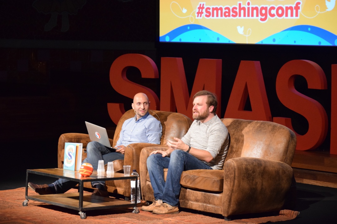 Vitaly Friedman talks with Marcin Wichary of Medium.com after the 1st talk of the conference.
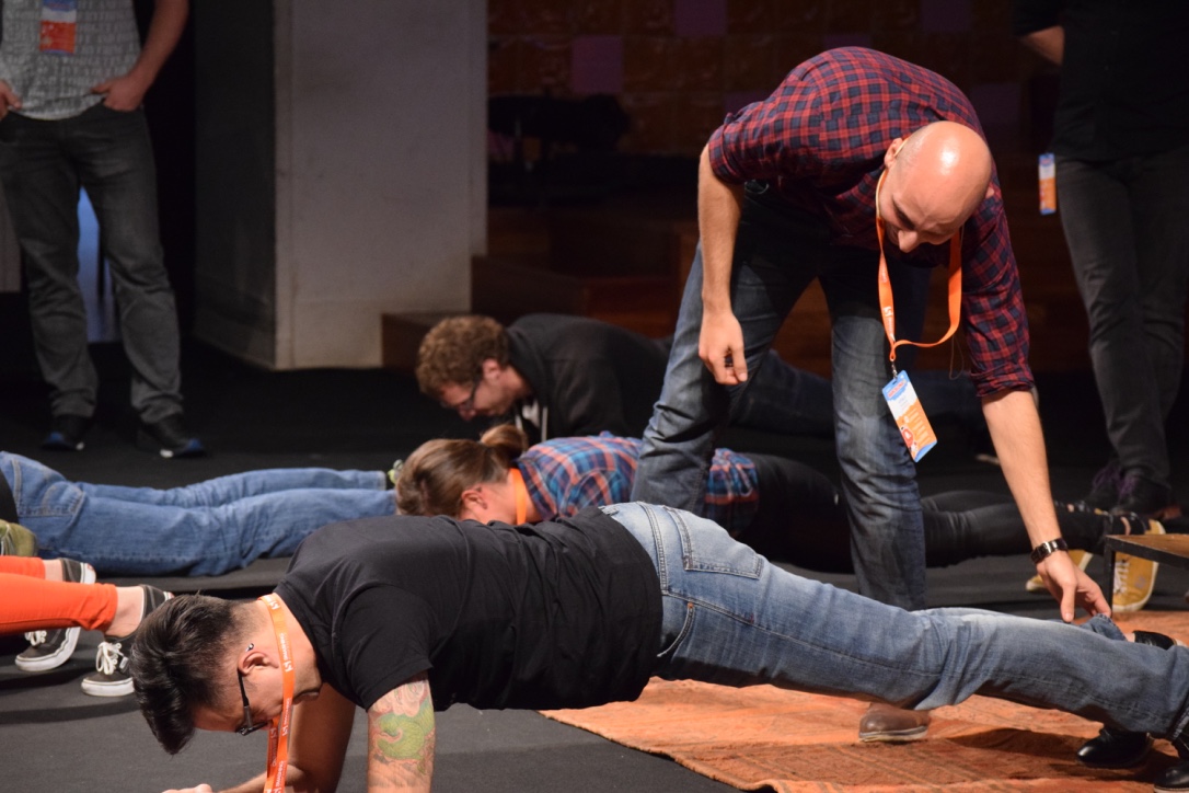 Vitaly Friedman challenged the audience to make a plank contest on stage.
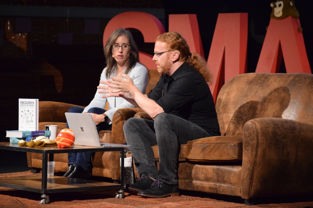 Christian Heilmann talks with Jen Simmons of Mozilla.
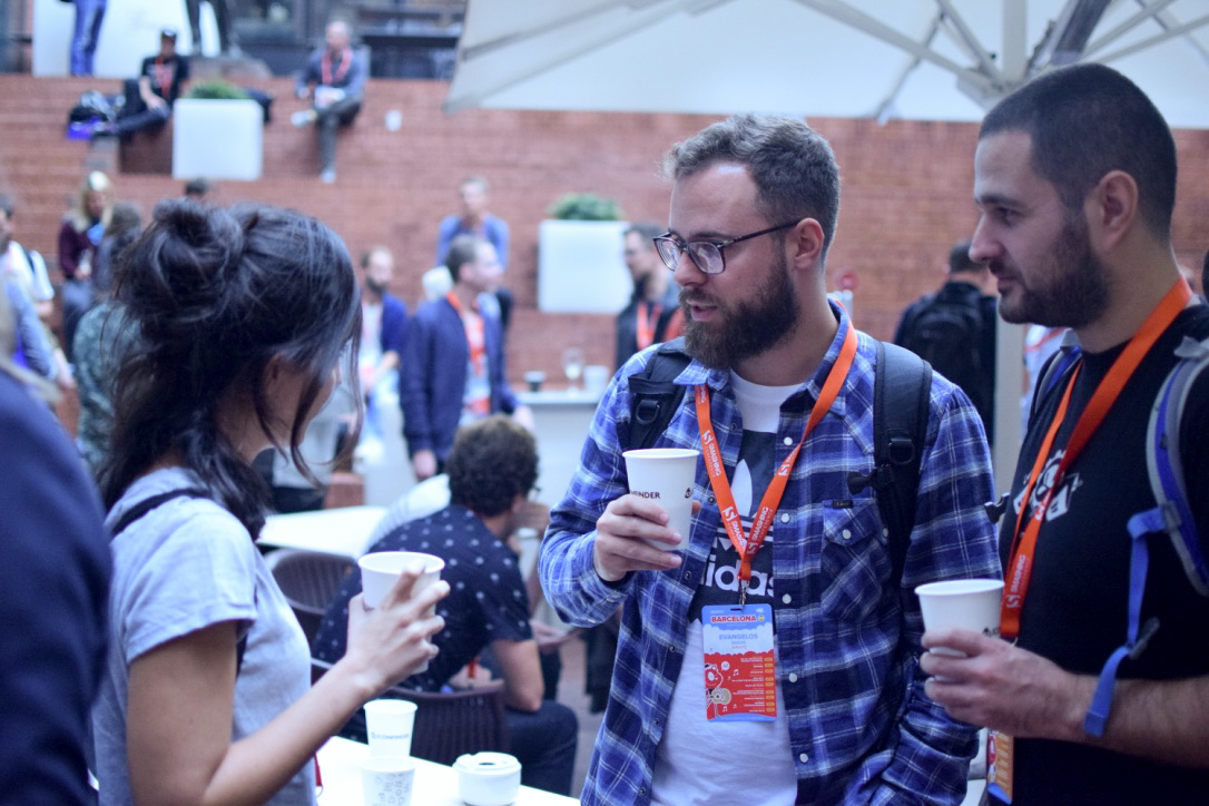 Us, taking a coffee during a break.
 A distant view of Sagrada Familia.
 Plaza de Cataluna.
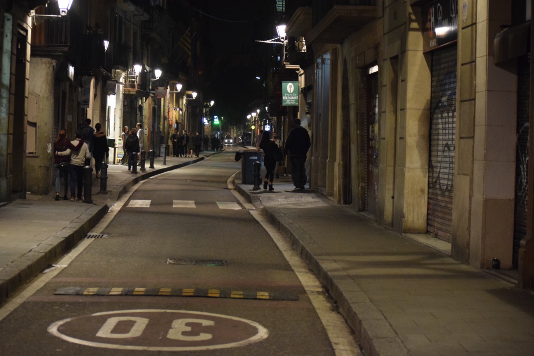 Old town of Barcelona.
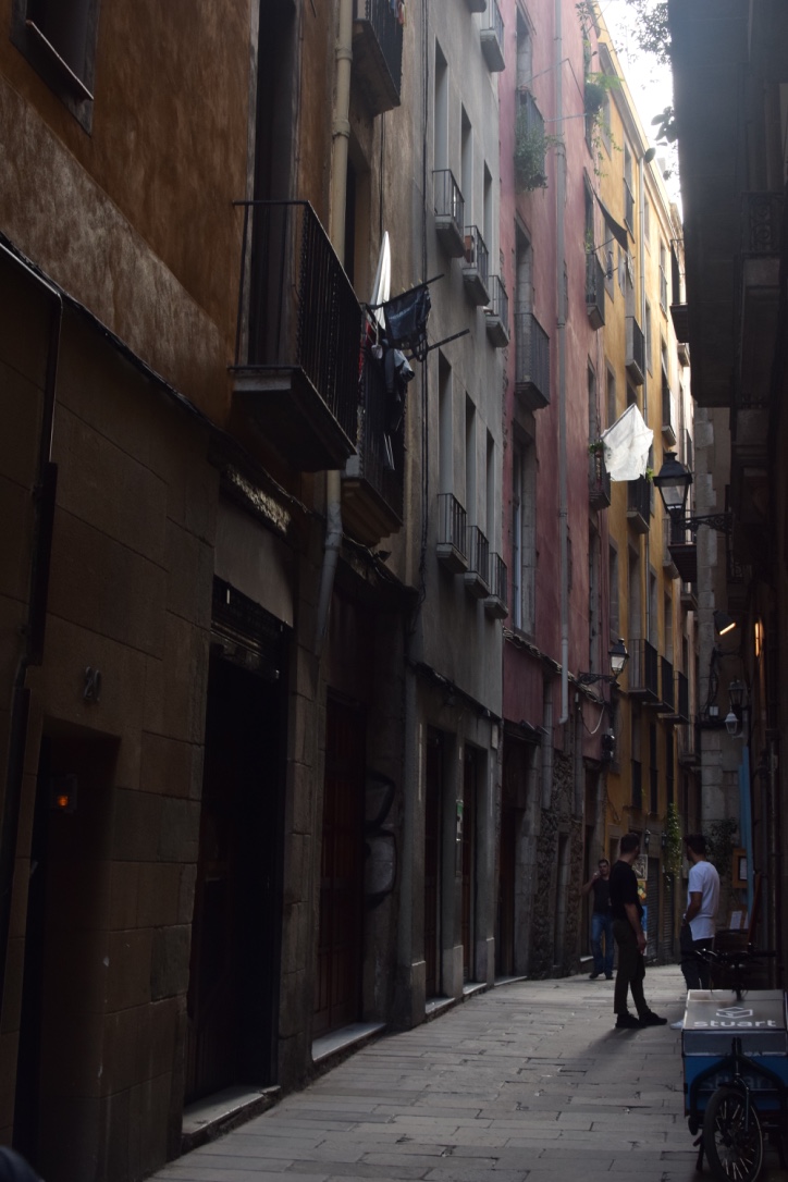 Old town of Barcelona.
 A view of Barcelona.
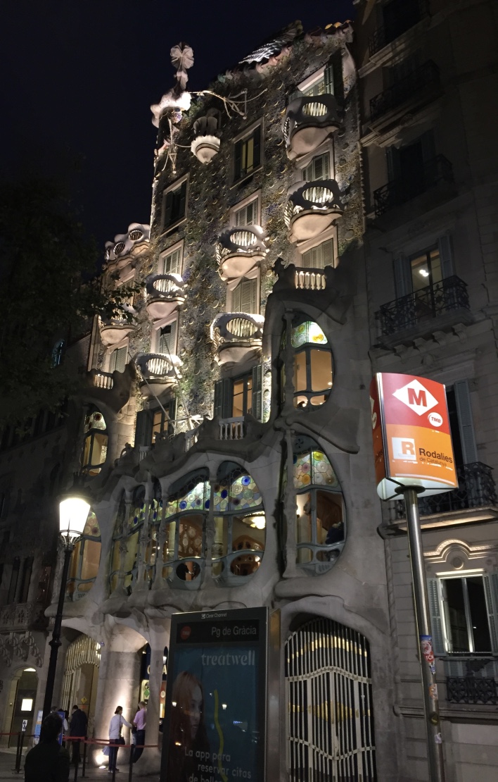 Night view of Gaudi’s Casa Batlló building.
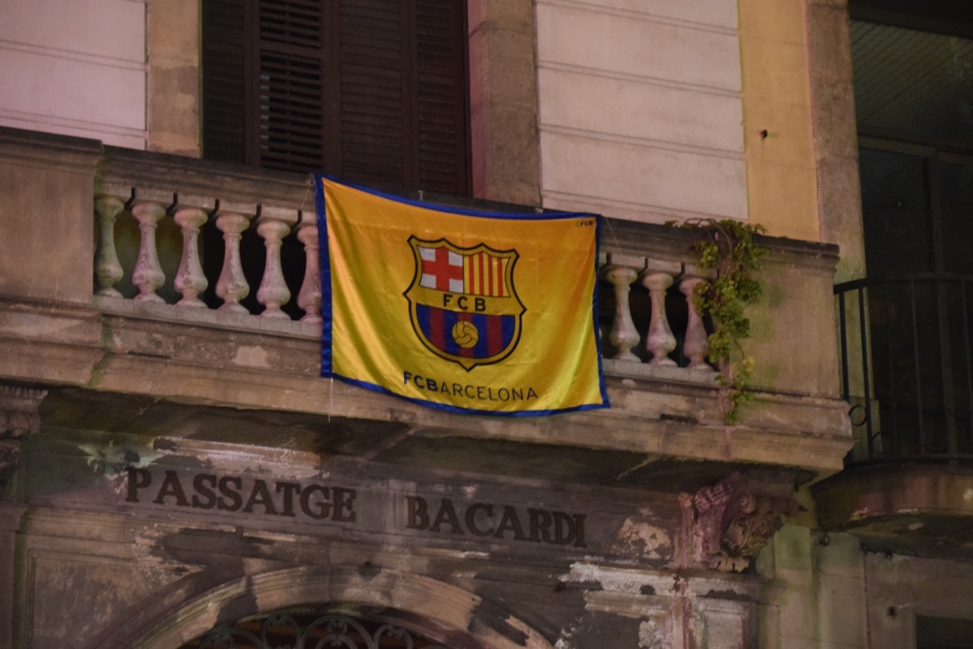 Barcelona club is everywhere.
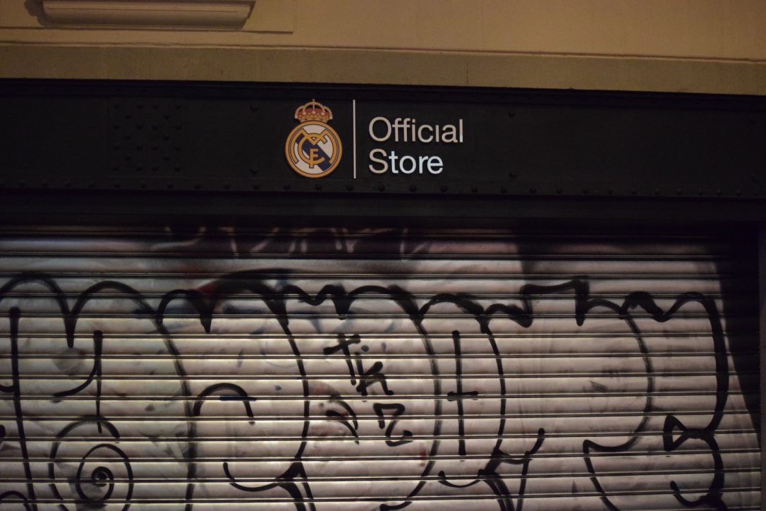 Real madrid club’s store.
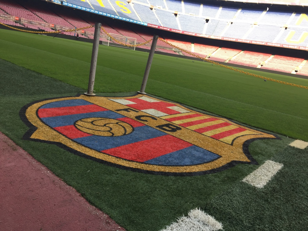 FCBarcelona’s Camp Nou view.
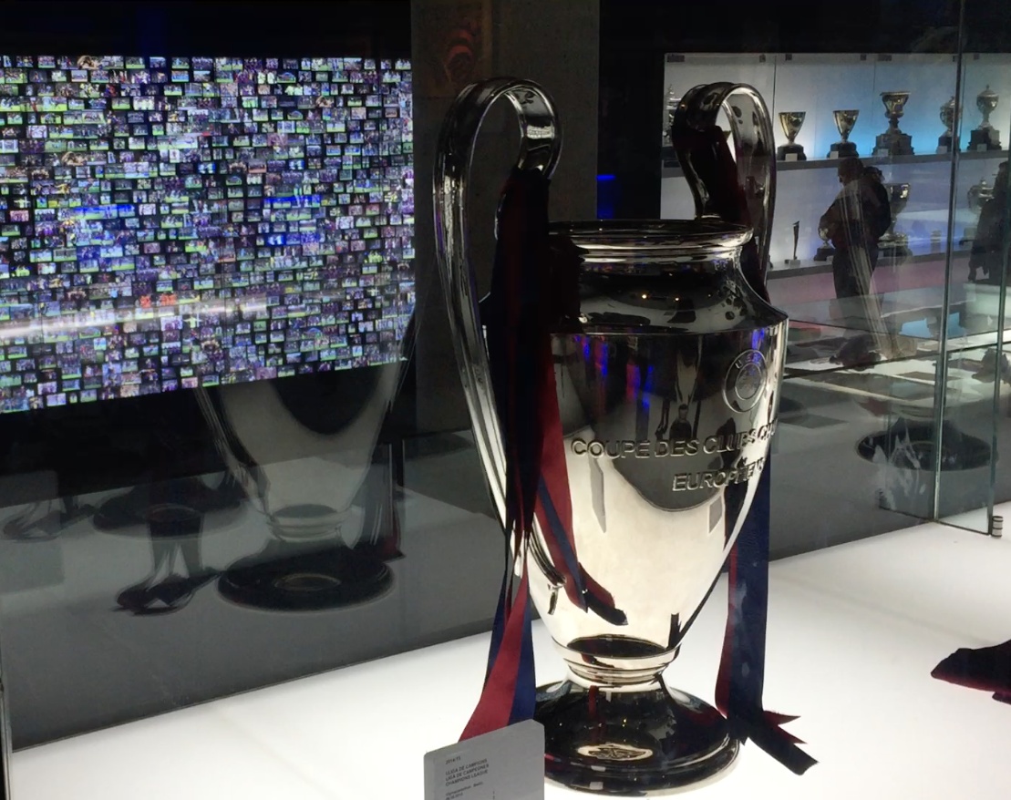 UEFA’s champions league cup.
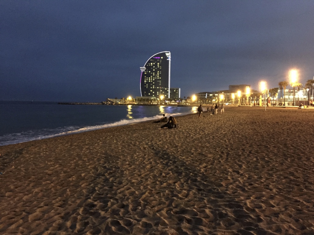 Barcelona’s beach, Barceloneta.