
At Skroutz, we believe that for a modern web experience, it’s important to get fast and stay fast.
For this, speed has always been a critical component for our Engineering and SEO Teams and we were monitoring speed KPIs early on.
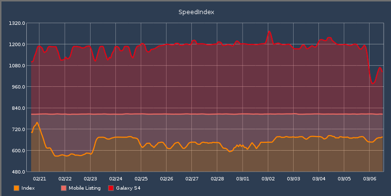
Image 1: SpeedIndex graphs for Skroutz.gr back in 2015.
As Skroutz.gr shifted from a price comparison site to a fully operational Marketplace, we made some serious changes to our core product. At the same time, our Engineering teams grew rapidly and on top of this, we architecturally moved our front-end stack toward heavier Javascript rendering, from a static to a more reactive fashion.
Occasionally, rendering performance was getting worse and until recently we were running ad-hoc sprints in order to improve Skroutz.gr ’s speed (read a post for such a sprint here).
Although we achieved better performance after each sprint -and hopefully a better user experience for our visitors-, we knew that this was not an ideal, sustainable process.
To solve this, we established an additional continuous monitoring and alerting system of Core Web Vitals using field data (real users) with a new set of tools and methodologies that we apply, in order to have these new metrics under our daily radars.
This continuous monitoring helps to not only be proactive from an SEO perspective, but also allows engineering teams to be in touch with rendering and speed issues and to organically establish a “fast speed mentality”.
In this article, we describe what we did, some real life cases we’ve dealt with, and some takeaways from our experience during the symbiosis with the Core Web Vitals real-time monitoring.
Core Web Vitals Continuous Real-Time Monitoring
Lab data is not enough
While lab tools are invaluable, the data they provide isn’t always predictive of how a website performs for real users.
For example, Lighthouse runs tests with simulated throttling in a simulated desktop or mobile environment. While such simulations of slower network and device conditions often help surface user experience problems better than native network and device conditions, they’re just a single slice of the large variety in network conditions and device capabilities across a website’s entire user base [web.dev/vitals-tools].
On the other hand, there is the Chrome User Experience Report (CrUX), a BigQuery dataset of field data gathered from a segment of real Google Chrome users, which presents Core Web Vitals with sufficient traffic, but only at the origin level. CrUX is still useful since one could compare it with field or lab data to see how they align.
Search Console’s Core Web Vitals section assesses groups of similar pages (for example, our Product pages) and also includes a Core Web Vitals report based on field data from CrUX, offering novel insights into how performance improvements impact the entire sections of the site and different page templates.
All these tools are extremely useful, but they alert us about any issues long after they have occurred, one would say a bit too late, as organic performance is already affected at scale.
How we measure Core Web Vitals
Since the Core Web Vitals metrics represent the user’s experience when interacting with a web page and they were confirmed ranking factors in Google Search as of May 2021 (along with mobile-friendliness, HTTPS-security, and intrusive interstitial guidelines), the importance of incorporating Web Vitals into our site hygiene monitoring practice was larger that ever.
We decided to collect field data from Skroutz.gr ‘s thousands of daily visitors in real time, process them and add some alerting heuristics. We used the web-vitals library, a tiny (~1K), modular library for measuring all the Web Vitals metrics on real users, in a way that accurately matches how they’re measured by Chrome and reported to other Google tools (e.g. Chrome User Experience Report, Page Speed Insights, Search Console’s Speed Report).
Mid July 2021, live monitoring for Core Web Vitals was launched. Using this library, we essentially render the web-vitals JavaScript bundles and invoke the functions for the 3 Core Web Vitals on Skroutz.gr.
We send a portion of the traffic (1% of random anonymized sessions, that is more than 100k pageviews & data points daily) at Grafana, an open-source visualisation and analytics software providing tools to turn time-series data into graphs and visualisations.
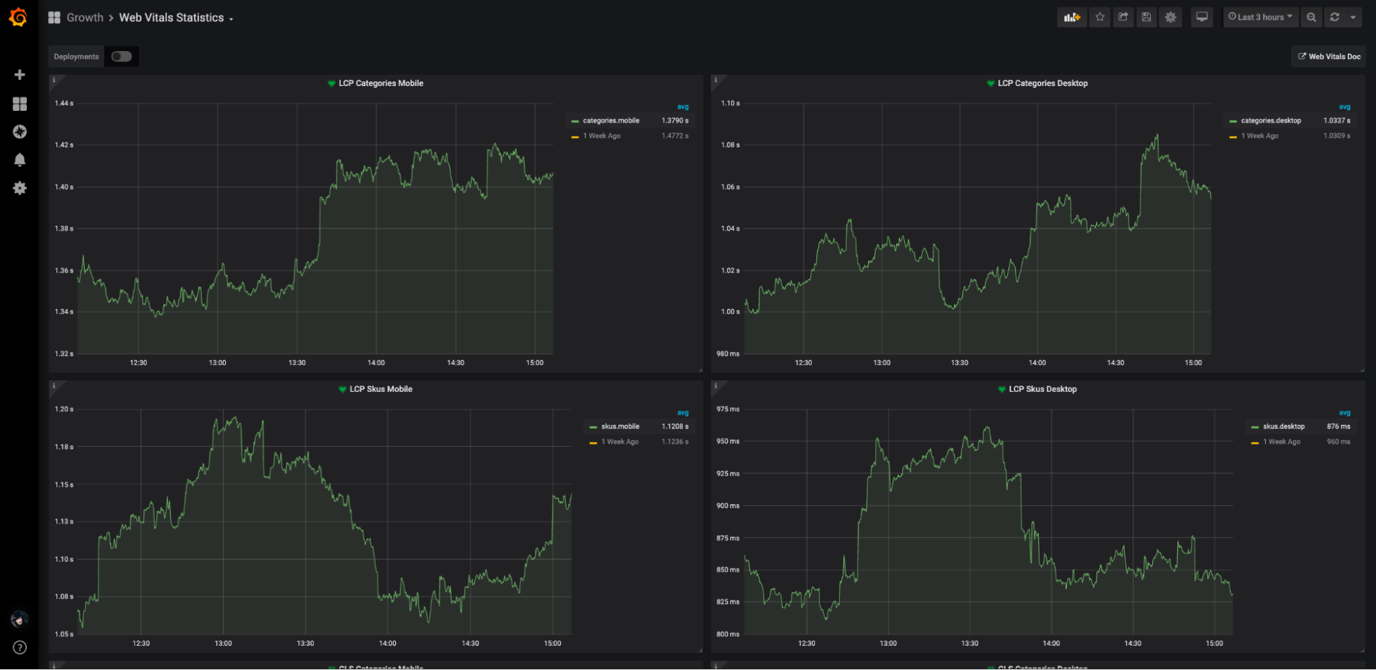
We have created dedicated dashboards for our most important site sections and we furthermore distinguish them into mobile and desktop traffic. More specifically, we are monitoring and visualising the scores of the 3 Core Web Vital Metrics (LCP, CLS, FID) per page type (Product Listing Pages (PLPs) and Product Detail Pages (PDPs)) and device type (mobile, desktop).
Image 2: Core Web Vitals (LCP) Real-Time Continuous Monitoring dashboard for Skroutz.gr.
How we get alerted for Core Web Vitals issues
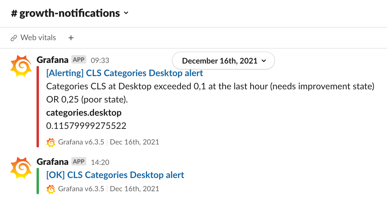
When each Core Web Vital metric drops below the “Good Performance” range, an alert is fired within a dedicated channel on Slack, our main communication tool. This way we are informed instantly when one of the Web Vital metrics drops at the “Medium Performance - Needs Improvement” state, while we’re also made aware of the exact section of the site that was affected.
Image 3: Web Vitals alert notifications in Growth Team’s slack channel.
Thus, we get alerted as soon as an issue appears, oftentimes before even Google was able to spot the affected area. Then we take immediate actions to remedy the situation.
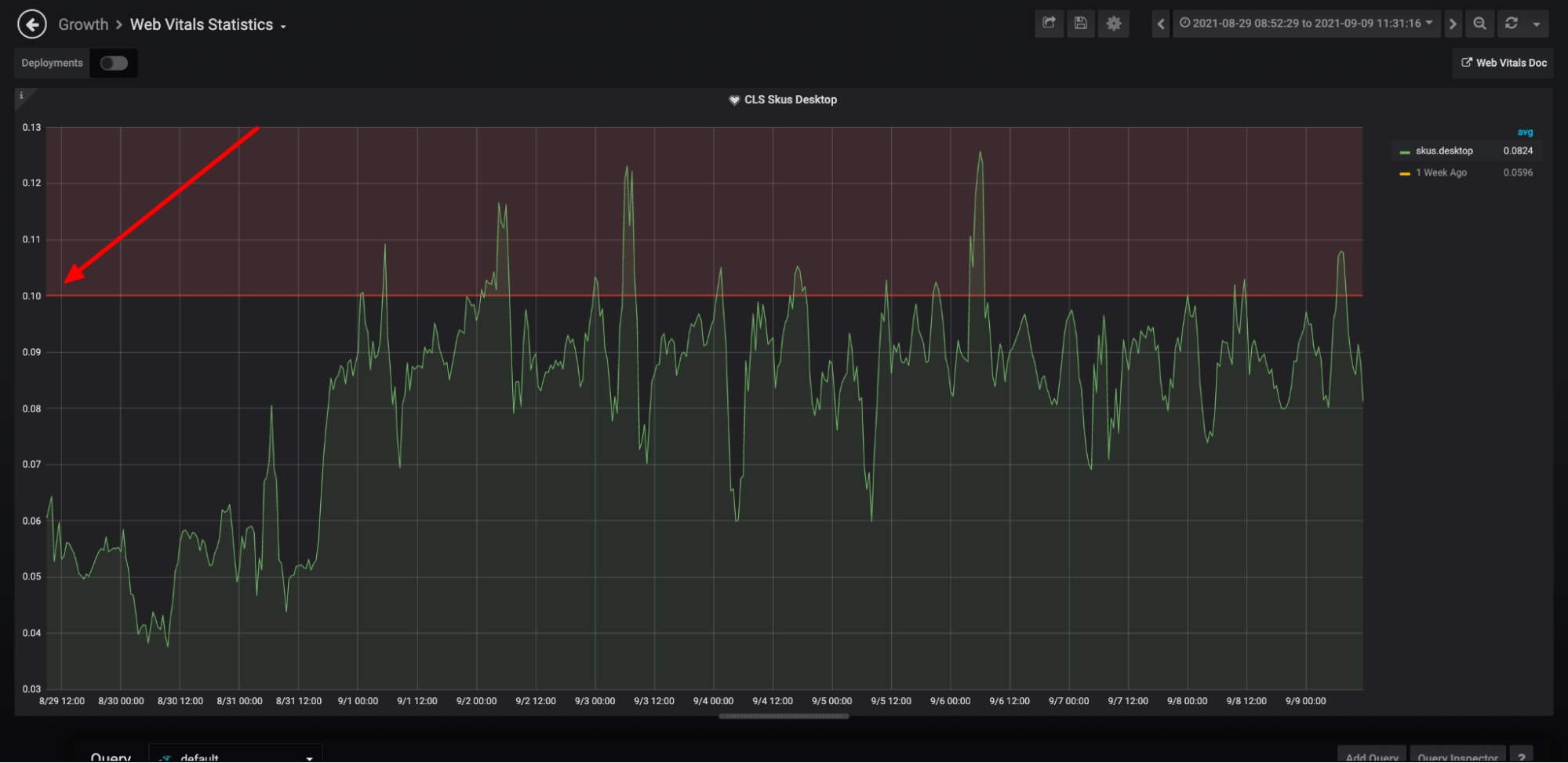
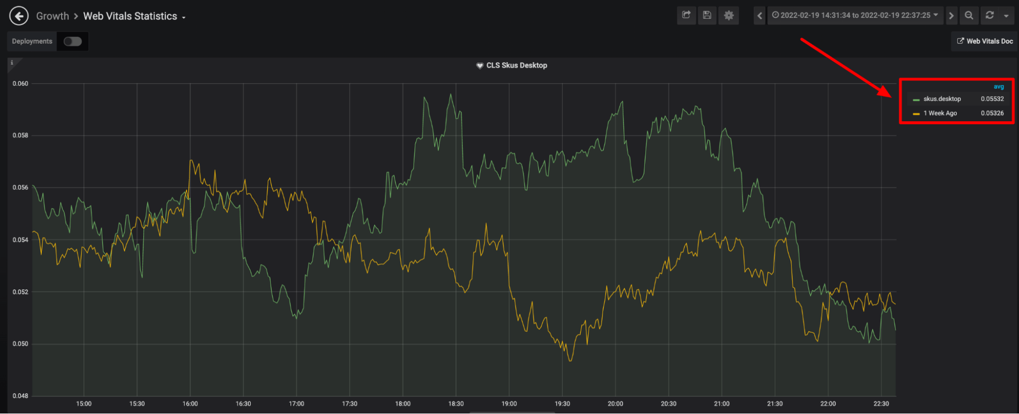
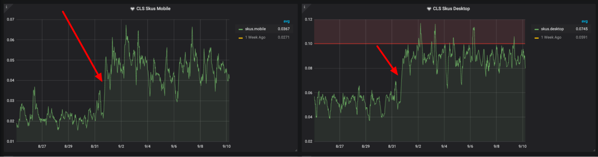
Image 4: CLS of Product Pages on Desktop exceeded the 0.10 threshold and an alert was fired.
We monitor 2 time series for each Web Vital metric, one for the current time and one for 1-week earlier, in order to make it easier for us to compare them and make up our mind as to whether the performance has significantly declined or not.
Image 5: Core Web Vitals (LCP) Real-Time Continuous Monitoring dashboard at Skroutz.gr.
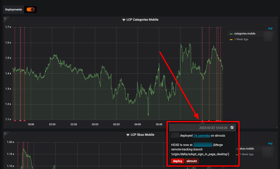
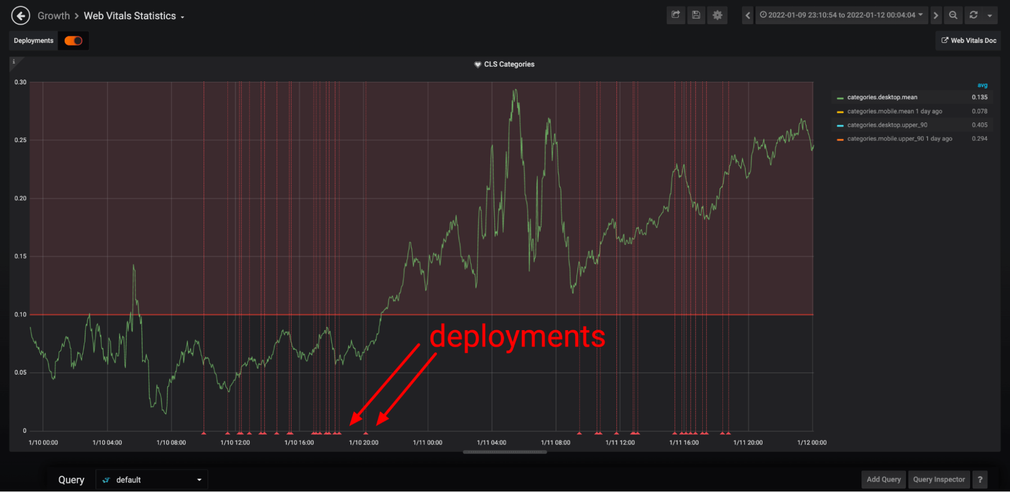
There is also a toggle option to see all the deployments. The exact time of each deployment as well as other details linking to the github page are easily accessible. This can prove very useful when an alert pops up, as it can direct the team straight to the source of the issue.
Image 6: Deployments annotation in the Core Web Vitals dashboard.
With the help of all these advanced monitoring systems and procedures, we keep Skroutz.gr fast and steady, we find and fix any rendering issues promptly, and we optimise user experience, which in turn leads to increased user engagement, more conversions, and -hopefully- higher user satisfaction.
Ιncorporating Core Web Vitals monitoring has led Skroutz.gr to an impressive 98,5% of ~26 million pages seen as providing a “good page experience”!
Image 7: Page Experience Score of Skroutz.gr at Search Console.
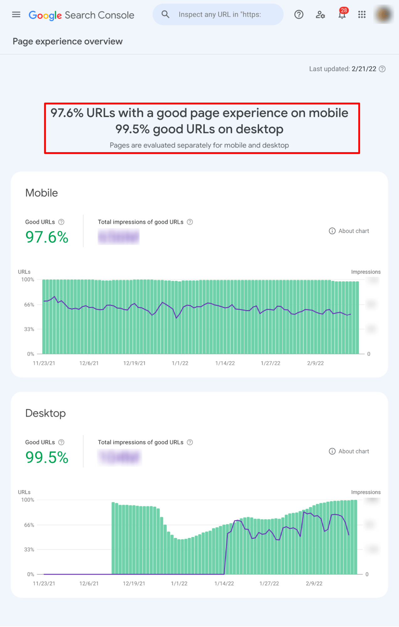
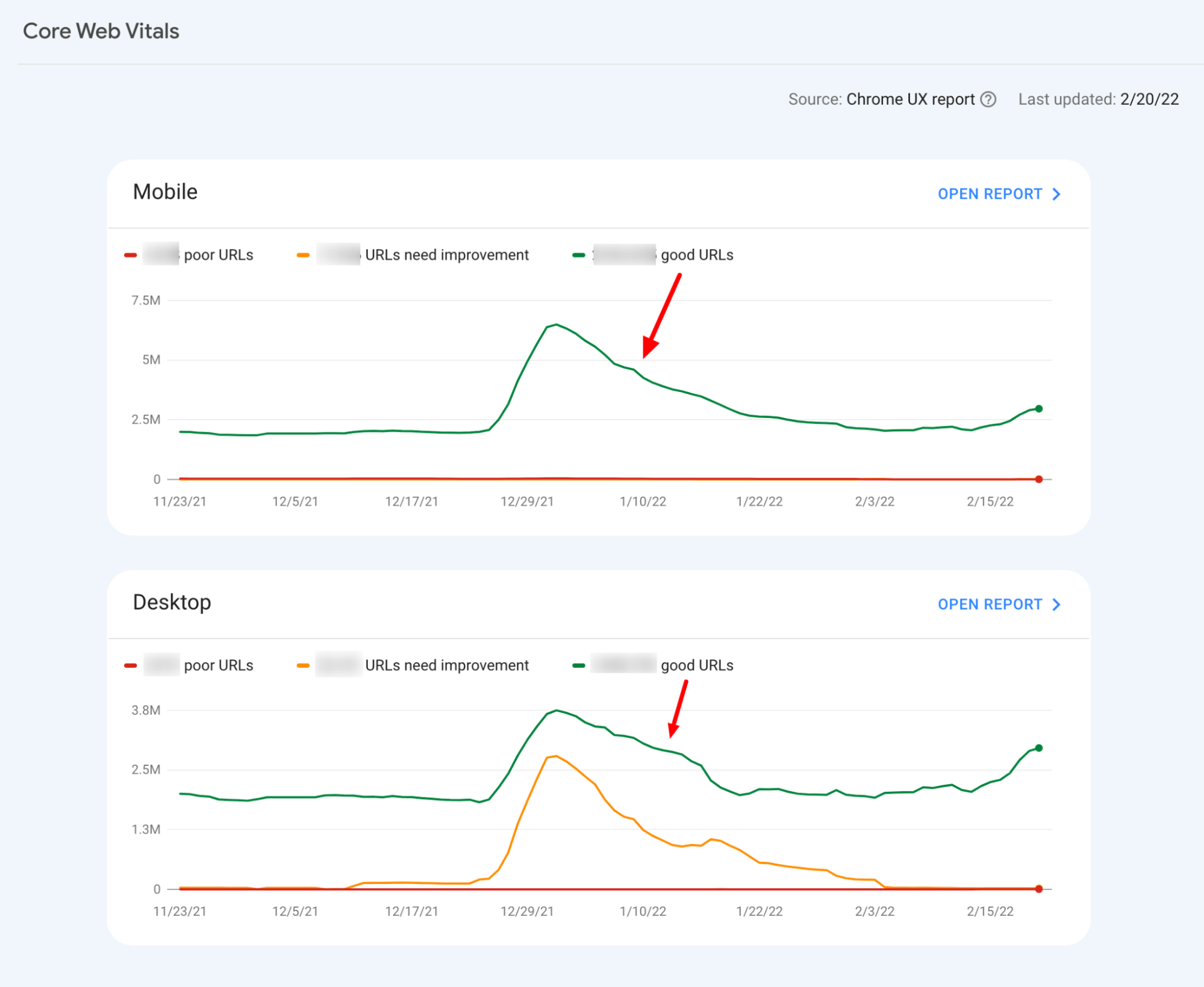
Image 8: Core Web Vitals of Skroutz.gr at Search Console.
Examples Of How Core Web Vitals Helped Us
Let us show you 3 examples of how Core Web Vitals real-time monitoring has helped us resolve issues that we might not have detected otherwise.
1. Server-side rendering gone wrong
The first example is from September 2021, where we saw an abnormal increase in pages’ rendering stability score, CLS (Content Layout Shift), almost 2x, and specifically on Product pages (PLPs) on both mobile and desktop.
This was very strange, because no matter the styling changes in mobile and desktop views, it is not really possible for different code (applied CSS styles in DOM) to cause such (relatively) huge layout shifts simultaneously.
Up until then, we had seen cases where a major page change impacted more in terms of layout shift in either desktop or mobile view (usually at the desktop where there is larger viewport to composite layout).
Image 9: CLS for Product Pages almost doubled in September 2021.
We deep-dived, but we couldn’t find any season for layout shifts caused by CSS changes - everything seemed okay.
However, a more careful examination showed that we had introduced a critical bug in the rendering process: we normally send a fully rendered page to the client from the server (server-side rendering) at the initial load; then the client’s JavaScript bundle takes over and manipulates DOM depending on the users’ interactions. This approach has been chosen as more SEO-friendly. What we saw, in this case, was that during a major refurb of the Product page, we accidentally disabled the server-side rendering and the page was rendering in the browser.
Since our pages are often heavy and rich in content, browsers struggled to composite and paint, resulting in more layout shifts compared with the server-side rendering.
If we didn’t manage to catch this error early, we would probably have been impacted severely in terms of SEO and organic performance. Product prices, reviews, info, etc. are changing very frequently and, especially in the ecommerce industry, content freshness is very important.
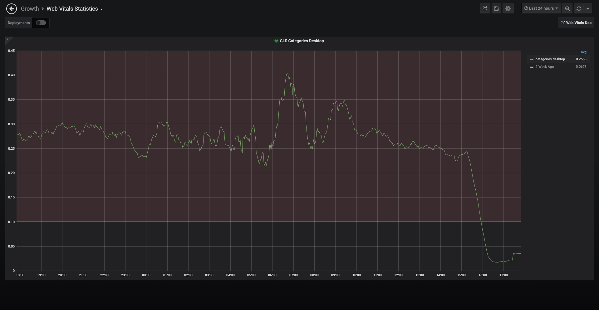
2. New fashion categories layout shifts
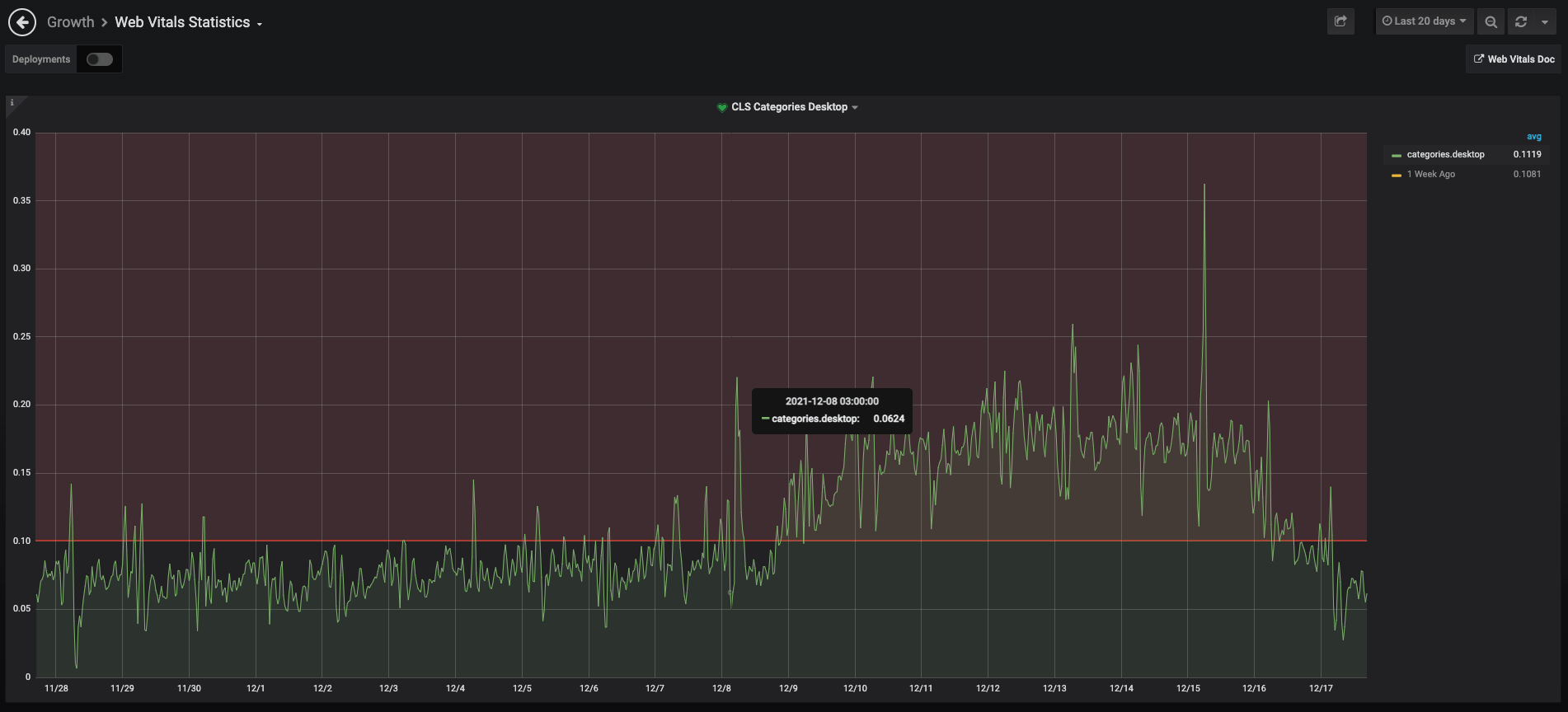
The second incident began in December 2021, when a number of alerts started popping up, regarding the CLS score of our Product Listing Pages (namely Categories) in desktop views. These alerts informed us about an increase of the CLS score up to 0.37, when a score of more than 0.25 is seen as poor performance.
Image 10: CLS on Product Listing Pages exceeded alert thresholds.
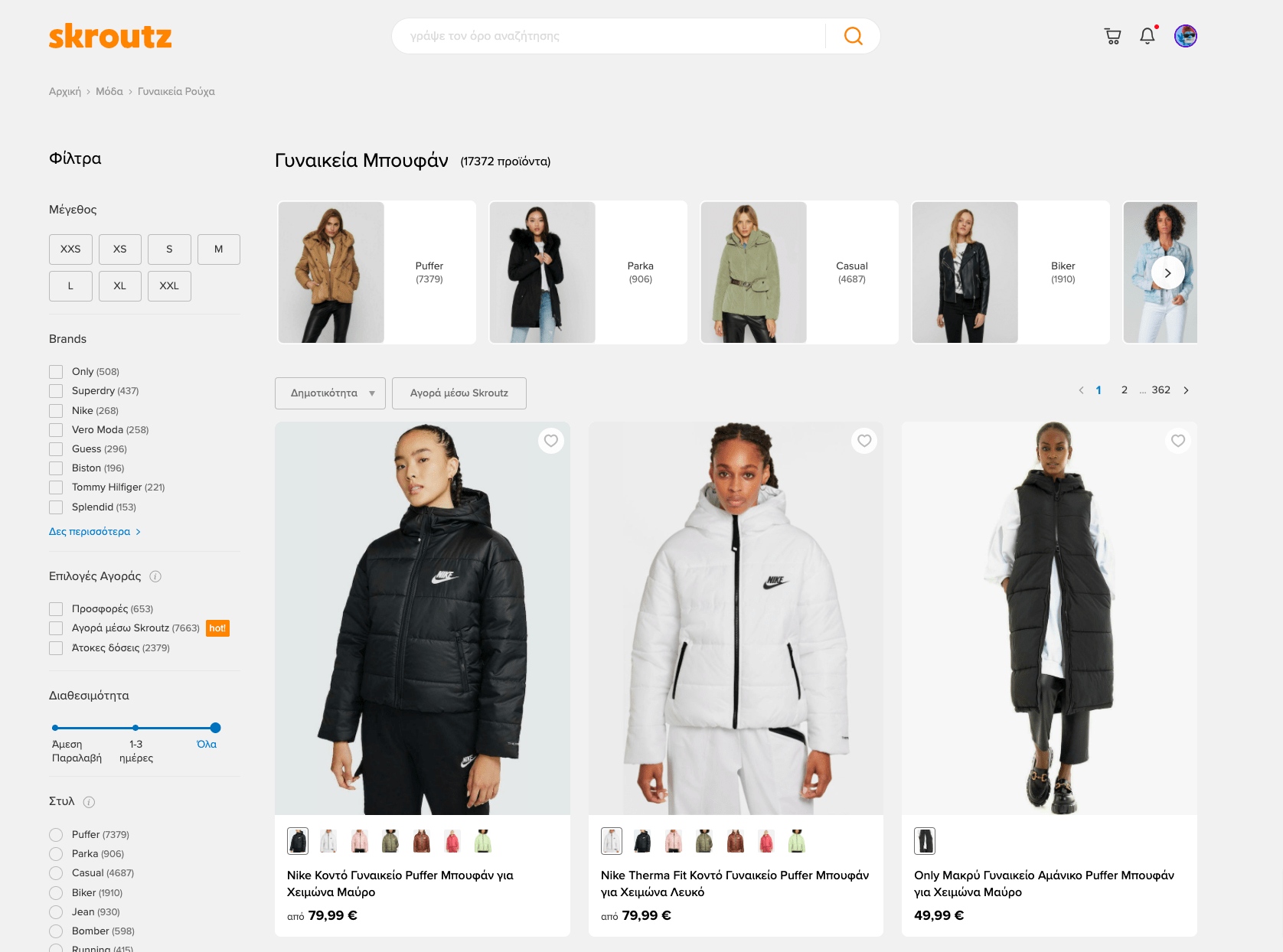
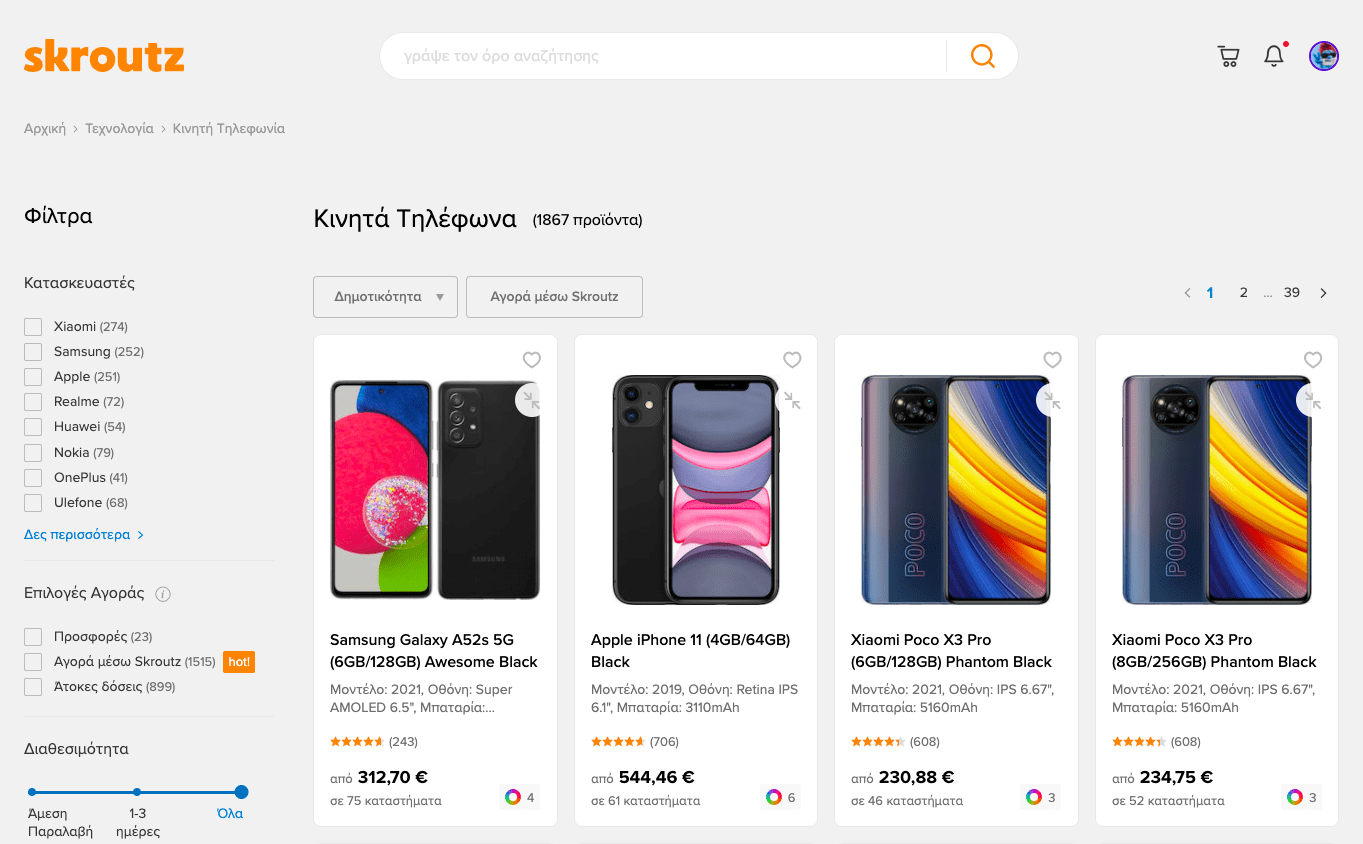
After examining the deployments that happened in the exact period, one stood out the most. All image driven PLPs (mainly Fashion, see example here) were switched to a new layout, going from the usual 4 tile layout to a wider 3 tile layout. Our new layout didn’t render in a solid and stable way, so users were seeing things pushed down and down while loading.
Image 11: New Fashion layout at Skroutz.gr.
Images in this layout have a fixed ratio, which is very helpful since we only set their width to fill its container and their height is auto-calculated. We already knew that we had an unknown variable, the image height. However, the width of the images was also unknown since it depends on the viewport, the grid, the grid gaps and the resulting columns. This meant we had practically no control over the width or the height of our images.
Setting a height or width on our images was in this case impossible, since we could not calculate either correctly. Using aspect-ratio was also not a safe resort back then, since it was a fairly new property.
So, we used an old CSS trick for creating responsive squares (initially), but the logic can be applied to rectangles as well. The % vertical padding of an element is always relative to its width and not its height, as one might expect. To avoid CLS issues and use fixed ratio images, we have a fixed ratio empty area, based on the available width that the image can then fill when it gets loaded without shifting the content of the whole page. Finally we had to absolute position the images and the gallery to go to the correct place.
We had a stabler layout.
3. CSS Grid module issues
The third example is again about CLS issues, yet again for Product listing pages in desktop view.
Product listing pages had marginally a good performance score (<0.1) for a long time, however this was okay for us.
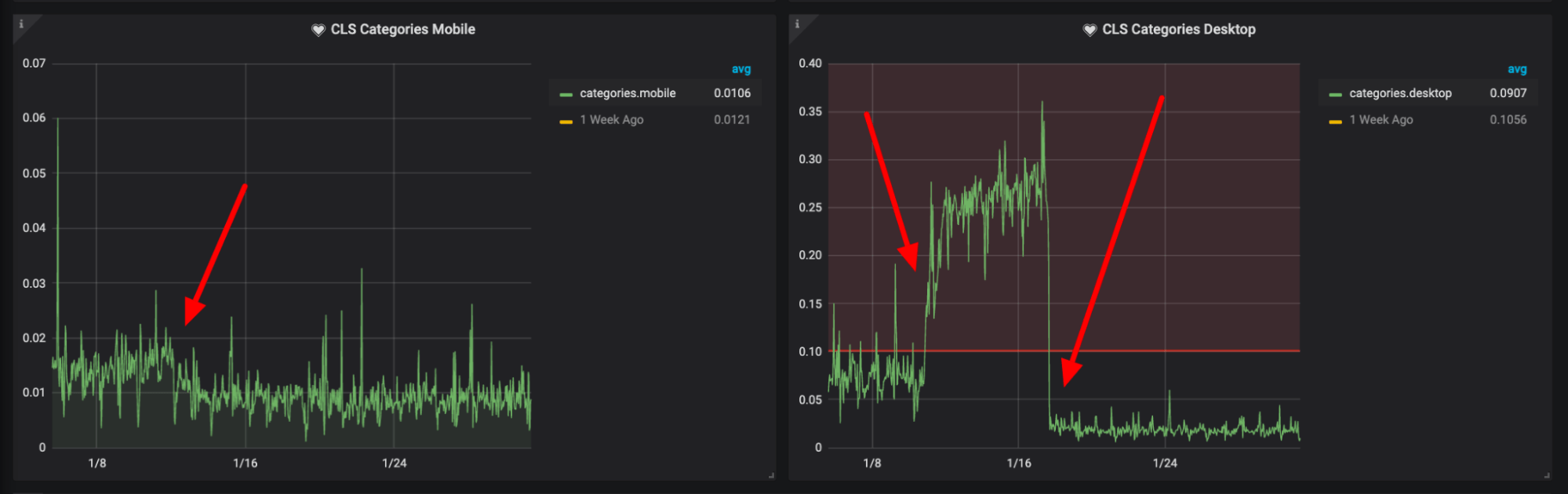
Unfortunately, on January 10, a huge layout shift triggered alerts in our slack channel. Something really bad had happened. The increase was observed only in desktop views, while at the same time mobile view had a small decrease.
Image 12: CLS for Listing Page Desktop almost tripled in January 2022.
When something like this happens, we usually search in the latest deployments, where it’s more likely to find the bug. However, in the specific example, we didn’t find anything that had changed on the Listing pages, front-end wise. Moreover, the increase started after working hours in a strange and unusual way.
Image 13: CLS for Listing Pages Desktop didn’t seem to correlate with a deployment.
When we investigated carefully we saw that this was a multi-factor event. One, Listing pages have not been optimal in terms of stability for a long time. Two, a Chrome update (97.0.4692) kicked in at that time, the new Chrome could evaluate something not optimal in a more rigorous manner.
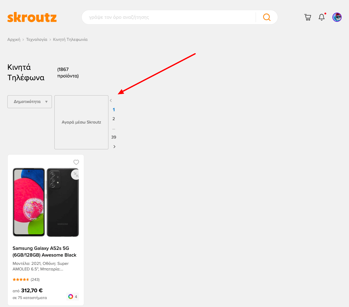
Normally, the Products Listing page has a left sidebar with the filters and a right -main- section with all the products.
Image 14: Normal Listing Page rendering on Desktop.
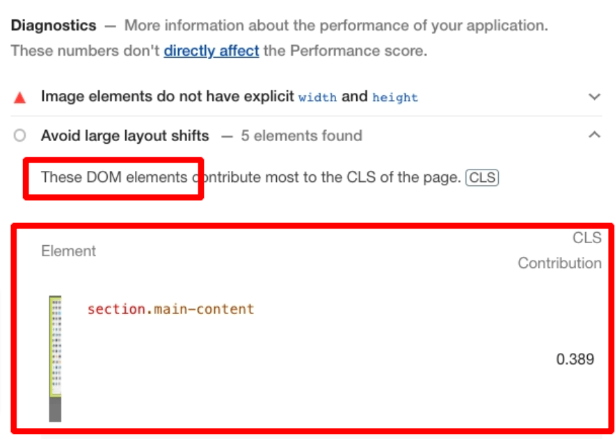
After we ran some tests we figured out that the layout shifts were caused by the main section of the page. What was happening?
Image 15: The main section contributed mostly to the problem.
Playing with network throttling and CPU slowdown, we caught the bug: the order of the elements (main, sidebar) in the page source for desktop were reversed on a markup level, so we were using CSS Grid modules to reorder them. Until now we specified only the order of the Sidebar (which comes after the main content in the DOM) and the Main section position was left unspecified. Since the sidebar in some specific cases was delayed, the main content would take its place from the grid-template.
Naturally, this caused a minor yet noticeable issue for the user and subsequently the Page Experience and CLS score.
Image 16: A middle state of Listing Page rendering on Desktop: content is pushed to the left due to lack of content in the sidebar.
The fix to this issue proved to be a very quick tweak in our CSS. The main change was basically specifying explicitly the grid column where the main section should stand.
After the fix, product listing pages improved and they are now much more stable than before.
Image 17: It is pretty amazing how 2 lines of CSS can make or break a page. Pay attention to your CSS grid module and make sure you specify all elements’ position to avoid any unexpected layout shifts.
We have also spotted changes of the other Core Web Vital metrics, Largest Contentful Page (LCP) and First Interaction Delay (FID), however the most sensitive to changes metric until now has proved to be Content Layout Shift (CLS).
Conclusion
Having the ability to measure and report on real-world rendering performance is critical for diagnosing issues promptly and improving performance over time. Without field data, it’s impossible to know whether certain changes are actually pushing towards the desired results.
Core Web Vitals helped Skroutz.gr provide a faster, stabler, and more responsive experience. Web Vitals real-time monitoring proved to be essential to delivering a great user experience, in terms of loading time, interactivity, and visual stability.
Image 12: Core Web Vitals Phone State for Skroutz.gr - January 2022.
Core Web Vitals represent the best available signals we have today to measure the quality of experience across the web. However, these signals and the available free tools are far from perfect and we expect future improvements or additions. This fact creates a crucial need for an engineering team that caters for all aspects of performance, while a good relationship between SEO and engineering is invaluable for a successful site.
Speed, stability and responsiveness are foundational parts of a good user experience. Since we are committed to offering better user experiences, striving for great site performance is a never-ending journey.
SEO Team.
💡 Feel free to connect and follow our fresh Skroutz SEO Team Twitter account for more SEO insights and news, or follow Skroutz Engineering at Twitter.
Hero image source: Unsplash.