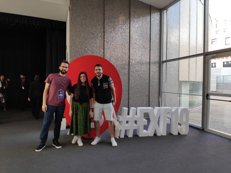
More than 30 experts from companies such as Adobe, Amazon, Booking.com, Habitant, Google, IBM or Telefonica have shared their vision about how games, inclusion and accessibility, and the recognition of emotions, voices, and behaviors, are some of the main points in the relationship between people, technology and products.
Speakers
- Ana Di Grigoli Global UX Design Lead @ AMAZON BUSINESS
- Peter Smart Product Leader @FANTASY INTERACTIVE
- Allie Vogel UX Designer @ BOOKING
- Tom Censani Director of Product Design @ EVENTBRITE
- Pablo Stanley Principal Designer @INVISION
- Neby Teklu UX Researcher @ Chan Zuckerburg Initiative
- Ana Molina Service Experience Design @ TELEFONICA
- Veronica Zammitto Leader (Corporate UX maturity) @ELECTRONIC ARTS
- Marie Van Driessche Interaction Designer (Inclusive Design) @VPRO
- Cathy Pearl Head of Conversation Design Outreach @GOOGLE
- Edwina Portocarrero Design Specialist for hybrid physical/digital playgrounds @MIT’s Media Lab
- Andreas Markdalen Executive Director of Design @FROGDESIGN
- Francisco Garcia Head of UX @ HABITANT
- Marc Roca Head of Service Design @ HABITANT
- Payal Wadhwa Service Design Principal @ IDEAN
- David De Prado Head of Design Enterprise Clients Solutions @ BBVA
- Veronica Bello Strategic Design Director @ DESIGNIT
- Ignacio Rivera Quintana CEO @ HIJOS DE RIVERA
ORGANIZATIONAL IMPACT OF DESIGN
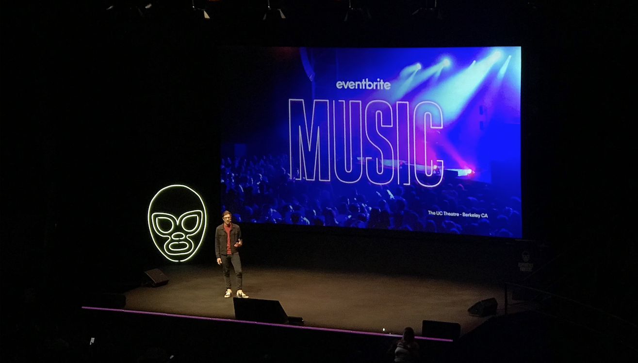
Tom Censani told us about the organizational impact of design and the shifting value of design in organizations.
At Eventbrite they work in a similar way to us, they are divided into teams called Squads with a Designer, Pm and Engineers practicing Design Sprints.
Problems they faced:
- Components were growing so much they were difficult to maintain
- Overcommunication and endless Meetings
- They built often a product from scratch without reusing components
- Cross-functional products were difficult to maintain and so they had different approaches for each platform.
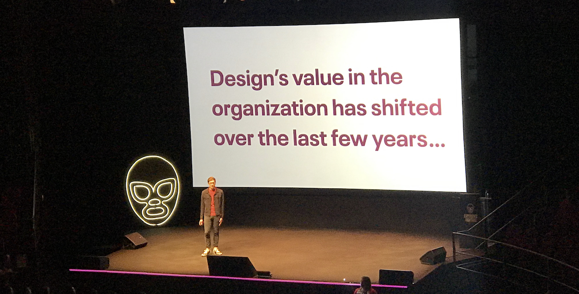
They improved their flow by creating style guides and well-defined files for each platform. Tom believes in this process designers play an important role and in the long run it makes a big difference in how effective teams work.
INCLUSIVE DESIGN, MORE THAN YOU HEAR
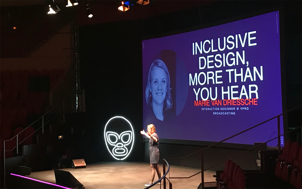
Another interesting talk was about inclusive design by Marie van Driessche, a dutch designer who works for VPRO Broadcasting. By inclusive design means designing for deaf people. Designing for deaf people actually results in designs that benefit people universally.
Some tips when designing for deaf people are:
- Use headings and subheadings
- Make one point per paragraph
- Use short sentences: seven to ten words per line
- Use bulleted lists
- Use accessible language whenever possible
- Write in a journalistic style: make your point and then explain it
- Write in an active form
- Avoid unnecessary jargon and slang, which can increase the user’s cognitive load
- Include a glossary of specialized vocabulary and provide definitions in simpler language
To sum up, there is no universal sign language and to avoid exclusion of the deaf users it is important to remember they are most likely second language users.
USER EXPERIENCE RELATED TO VIDEO GAMES
Deconstruction of the user experience in videogames
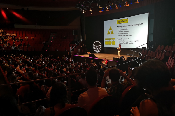
Veronica Zammitto, director of User Research at Electronic Arts, focused her talk on the concept of user experience and what it means in the field of videogames and showed new graphs of the well-known flow state for the player. In addition, he specified how to apply the Theory of Self Determination (STD) to games:
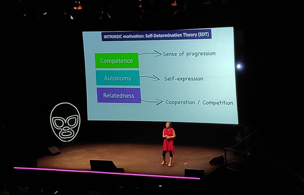
- Autonomy, which is achieved by giving options and freedom to the user.
- Competence, based on the concept of progress until achieving mastery.
- Relationship capacity understood as the possibility of connecting with others.
According to Verónica detailed, an extraordinary user experience, is achieved from two aspects:
Strategically, when you get to align:
- Business Management or Creative Direction
- Holistic User Experience
Tactically, to impact on:
- User behavior, cognitive ability, and emotion
- Usability and the ability to achieve
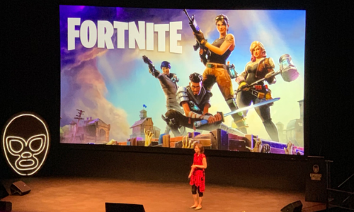
Celia Hoden, a researcher at many video game development companies – such as Ubisoft and Epic Games – spoke about one of the most successful games currently, Fortnite, precisely from Epic Games. In her talk, he specifically discussed the way in which this video game applies some of the principles of the user experience.
First, she commented on some basic psychological aspects. It began with the subjectivity of human perception and the limitation of attention, which complicates the processing of information. And he continued with the unreliability of memory to remember that information. Fortnite uses some techniques to deal with these conditions, such as these examples:
- Reduce the need to memorize, making the necessary elements to remember on the screen very accessible
- Adjust (and test) the icons to be properly perceived
- Avoid multitasking in those moments where it is necessary to learn the mechanics of the game
Finally, she summarized that the user experience in video games is a mixture of the known principles of usability (system feedback, clarity, consistency, error recovery, user control, etc.) and the ability to captivate the player through of motivation, emotion and the ease to reach the flow phase, that moment where the difficulty of the game and the skill of the player find their ideal relationship.
MY UX “SAGA”: TEACHING THE PEOPLE WHO MAKE GAMES A NEW WAY TO PLAY

Chris Grant, Global UX Director at King (the makers of Candy Crush), talked about how companies try to find ways to improve User Experience nowadays. Referring to his own story, in the field of mobile gaming, he shared with us the Testing process inside King.
Their first approach was to establish a Testing Lab, King’s Testing Lab – a well-equipped room where external users-testers could come at King’s offices and play/test their games. They knew that this was not such a difficult mission for King where the offices are beautifully decorated (someone could say like a playground) with joyful colors. However, they decided to follow the simplest path. To bring family and friends to test their games like drinking coffee at home. They realized that this method worked better and here is why:
- First of all, Design and Product Teams don’t have to establish a gift or reward system to attract testers, which means that with basic and simple resources UX Testing is a tangible goal. Also, regarding the technical equipment, they just use the equipment they have on their meeting rooms (private system cameras) and record the testing session.
- As for the rest of the process, the facilitator (UX/Product designer, researcher) stays next to the tester, keep notes, asks questions, observes gestures and behavior, something that encourages the product teams to be an inextricable part of the process, learn continuously and identify user needs.
- They develop a strategy on UX Testing to evangelize and drive adoption
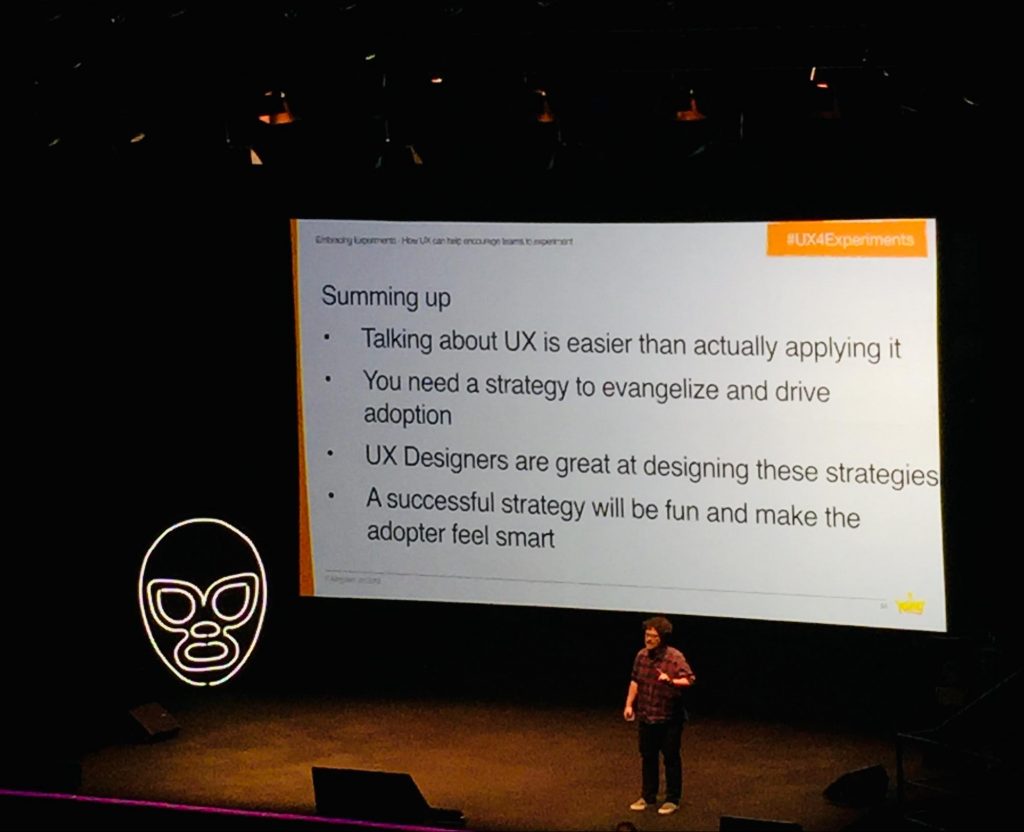
King is a leading interactive entertainment company for the mobile world, with people all around the world playing one or more of their games.
Famous Games: Candy Crush, Bubble Witch, Farm Heroes, etc.
DESIGNING FOR EQUITY IN CLASSROOMS
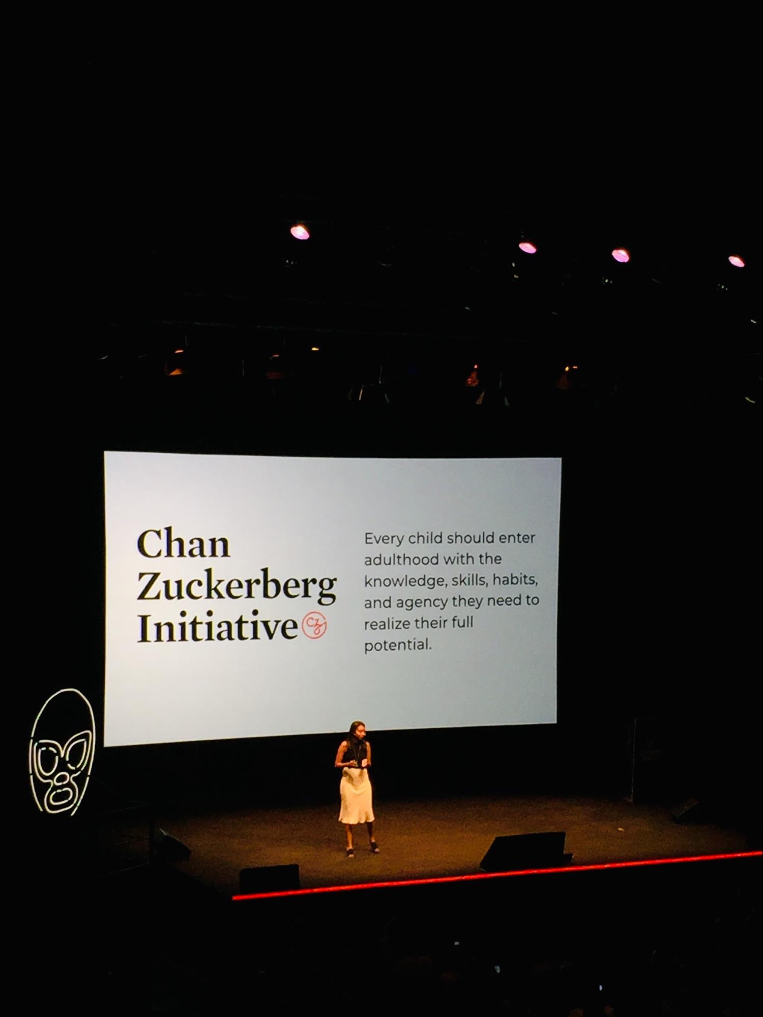
When most people hear “accessibility”, they tend to think about one group of people: the chronically blind. While the needs of this subset of our population are critical and often underserved, this perspective fails to address how we are all beneficiaries of accessible design.
In this talk, Neby Teklu, UX Researcher from Chan Zuckerberg Initiative, presented a modern perspective on what it means to have a disability.
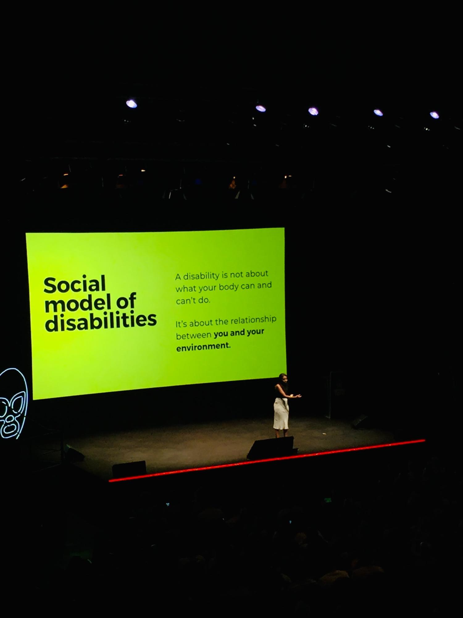
Every experience we create has the potential to include or exclude people. Here comes Neby to explain that through the Inclusive design process, emerges a social model of disability: A disability is not about what your body can and can’t do. It’s about the relationship between you and your environment. Moreover, disabilities are contextual and not static. That means we, as designers, have to keep in mind always the human factors while designing for people and what Neby highlights at the end on her presentation is that once we change the way we perceive the word disability, we are going to be ready enough to change the word around us.
The Chan Zuckerberg Initiative is using technology to help solve some of our toughest challenges — from preventing and eradicating disease, to improving learning experiences for kids, to reforming the criminal justice system. Founded by Priscilla Chan and Mark Zuckerberg in 2015, CZI’s mission is to build a more inclusive, just, and healthy future for everyone.
PRACTICAL MACHINE LEARNING FOR THE HUMAN EXPERIENCE
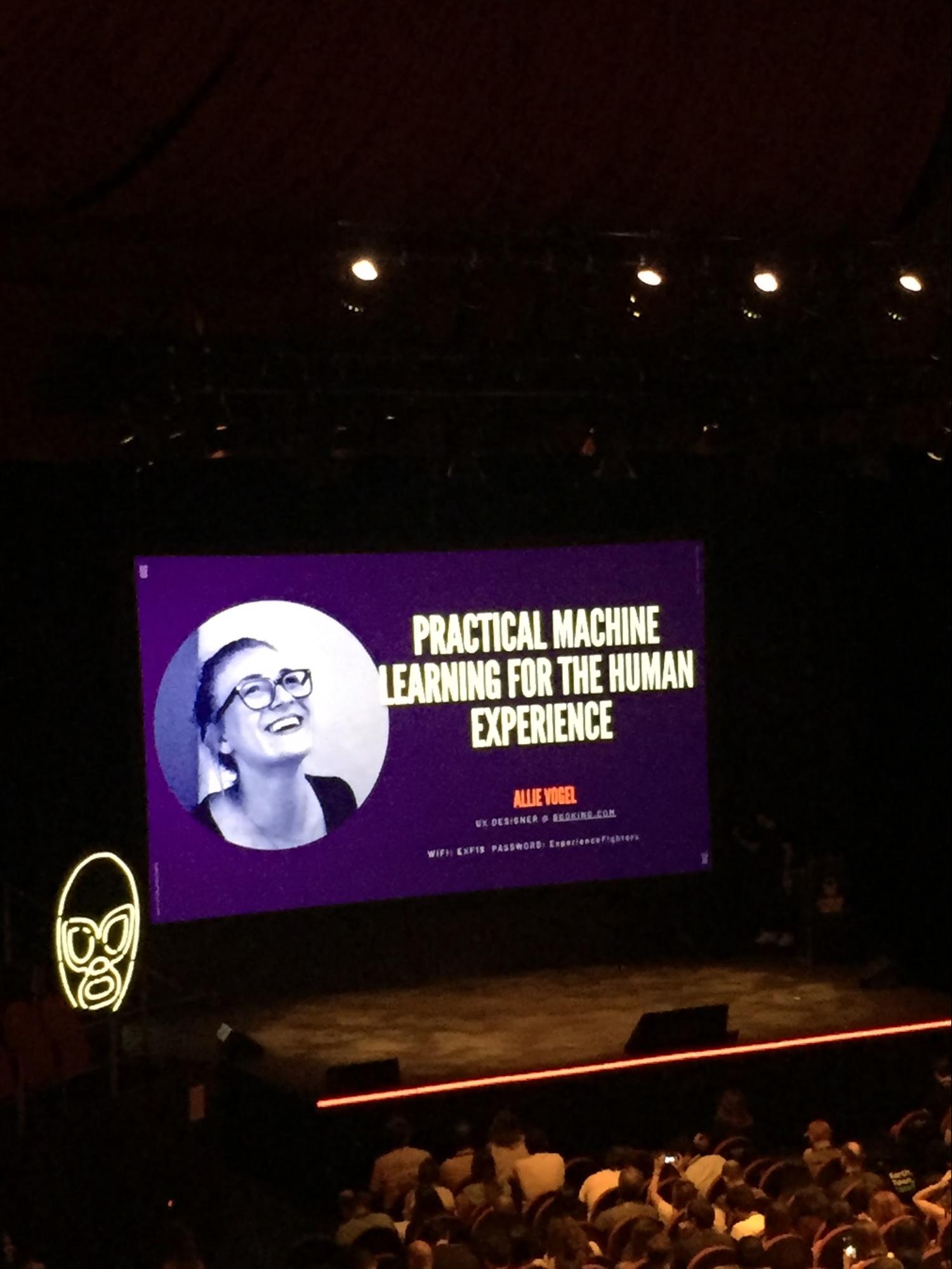
Allie Vogel, UX Designer (AI & Machine Learning) at Booking.com in Tel Aviv, talked about how Machine Learning can help the design process in order to create user-centric products by personalizing experiences to the individuals who use them.
Booking.com is utilizing Machine Learning to enable people to experience the world in a personalized way. But, sometimes user’s reactions to these predictions are not what we could expect. When using Machine Learning, we, as designers, have to think about the level of sensitivity.
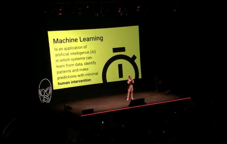
At Booking.com, they hired top data scientists and started happily investing on this technology but they actually recognized they had a huge gap because they didn’t actually know what type of features and products their users wanted to see when it comes to personalization in travel. So as a reaction to this, they started conducting user research on real users using tools like form discussions, diary studies, 1-1 interviews and focus groups by simply asking them the question: Which products that use Machine Learning are the ones you love? The main learning was that context is key.
So, what are the best practices for designing better user experience and how can we practically integrate Machine Learning features into our products in the most human-centered way?
- Create trust with users. Gain users’ transparency and explain why we are collecting their data and what the benefit for them will be. Working with Copywriters and UX writers is vitally important in order to build trust through clear context.
- Make sure that data collection is as beneficial for the user as it is for the business. i.e Google search uses a microcopy in a small version format asking users how the recommendation was and why it’s not relevant at all.
- Communicate with users. Tell our users why we are delivering this content.
- Let our users be in control of what data we are collecting (GDPR) and the type of information we’re pushing to them, let users tell us what they want (i.e using control panels with radio buttons to switch on/off)
- Delivering the right message at the right time (push notifications).
- Managing mispredictions. As User Experience designers we need to think about what happens when an error arises in Machine Learning and design always by keeping that scenario in mind.
Where can designers shine?
As UXers we need to get involved from the beginning and have meaningful conversations with data scientists and product managers. We need to do this in order to create the best solutions for our final users. Instead of looking for the best ux solution, we need to think about how to create experiences. As UX designers we must bridge the gap between Artificial Intelligence and real human behavior and emotion.
DESIGNING FOR PEOPLE NOT ROBOTS
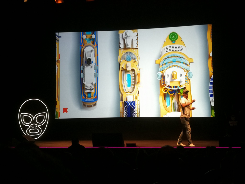
Peter Smart shared some practical examples about how to deliver really immersive experiences that work before, during and after the real deal. How they offer rich, fluid interfaces focused on the flow and context of what the users want at any moment.
According to Peter experiences, they’re those special things that really connect with us as human beings so therefore user experience designers have an amazing privilege but the problem is so much of what we see today isn’t about being a user experience designer, it’s about being a user transaction designer. It’s about data in and data out as quickly and efficiently as possible. People are spending 21 years of their life in front of a screen, interacting with the things that we as designers making for them. So, that’s the amazing privilege that we have as user experience designers we get to create magic for people.
Experience Principles:
- Context is everything
- Create experiences that don’t create work for the user
- Support Decision moments
The ultimate objective for Peter is to “Create the industry’s most impactful experience.”
Creating the framework – Blocking out the spatial map and navigation of the experience
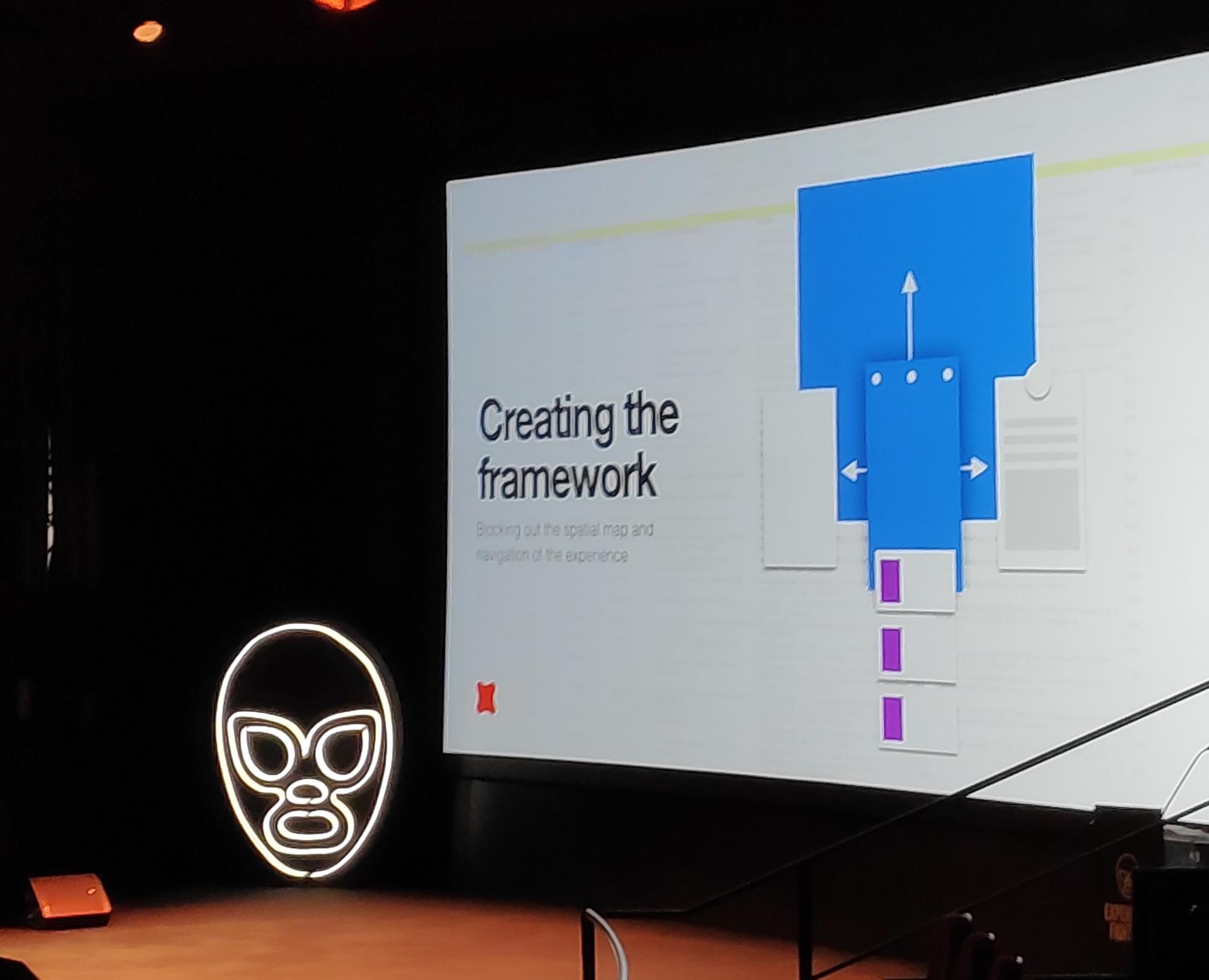
Instead of starting to wireframe or breaking things what they did was just take a step back and just kind of relate one of the really kind of practical things and what they did is to create a framework. A framework is kind of a canvas-like physical way of understanding how an application is going to come together it’s part interaction design it’s part content but all of this is designed to start laying out at the application in a very physical way so that they can begin to rapidly prototype.
Scrappy experiments
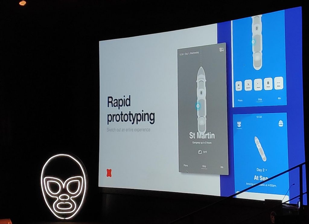
You may be embarrassed to show these but this is really the sausage in the making even though it looks terrible here is all the essence of so many of those ideas.
With experiments, we are allowed to communicate different ideas and ultimately get people excited
Learnings from Case studies Fantasy Interactive
- Testing
- Creating the design system (To scale across the entire digital ecosystem)
- Evolving and adapting
- The final live result (Visual System – Including live sun position)
- Working with content (Redefining the guidelines for creation)
- Creating fluidity (Flows not screens)
- How much commitment it takes to follow through on a vision
- Creating with vision pays off(!)
- Minimum Loveable Product
- Convention is just permission to try better
- Draw for real world
- Think inflows not screens
- Less but better
- Fill it with life…
“…if it fills you with life when you’re designing, it’s gonna fill those with life that you’re designing for as well!”
