On October 17th and 18th we* attended Smashing Conference in Barcelona.
Last year’s Barcelona Smashing Conf was quite inspiring, so we decided to attend it again this year.
SVG, web typography, user experience common problems and many more, were among the topics that presented and discussed. And here are our notes.
Short version
Collaboration between teams, especially large ones, is hard. Brad Frost showed us patterns and guidelines one could follow in order to make communication between teams easier.
Paul Boag also analyzed the value of centric thinking and ways for a team to prosper.
Animation on the web is very important toward the meaningfulness and the joy a web page has. Sarah Drasner’s talked about it and showed some practical examples how to coordinate it with vue.
Stephanie Walter’s talk was about user experience and more specifically the analysis between objective and psychological time and how users perceive it.
SVG is a hot topic in design world. Tyler Sticka and Chris Coyier showed us some tips and tricks in creating and implementing SVGs.
Almost every person who is working in the web industry and technology in general, has felt at least once overwhelmed by the rapid evolution of tools and technologies. Thus, it is crucial to decide which ones to choose and invest our time in. Jeremy Keith’s talk elaborates on this.
This year’s mystery speaker was Lea Verou, who is very well known for her advanced CSS tricks. She talked about the very impressive and promising CSS variables.
Denys Mishunov’s talk had nothing to do with design or development. Psychological concepts like perfectionism, imposter syndrome and burnout affect our lives as professionals. So, we need to seek and find ways to “debug ourselves”.
Chris Lilley and Monica Dinculescu talked about web typography and fonts.
Last but not least, the other speakers were also great and very inspiring!
Full version
Chris Lilley on “The State of Webfonts”
Chris Lilley, known as the @svgeesus, is technical director at the World Wide Web Consortium (W3C). He is considered “the father of SVG” and chaired the group that developed @font-face and co-developed WOFF.
In his talk we can surely say he digged a lot into fonts. He led us through the differences of glyphs, characters and fonts to unicode ranges, in order to avoid the known hack for ampersand character. He talked about font-variants and their current support, Chromatic Fonts, and more recently OpenType variable fonts – a single font file that behaves like multiple fonts. The capabilities opening up for typography on the web are extraordinary. You can see his talk video here.
Tyler Sticka on “SVG: So Very Good”
Tyler Sticka is a partner and creative director at Cloud Four. He helps vanquish complex responsive design challenges for clients like Walmart Labs while blogging about SVG and other web ephemera.
SVG was a “hot” topic at Smashing Conference in Barcelona this year, and Tyler was surely an enthusiast and a motivator. His talk pointed out SVG alternatives for common terms like icons-fonts and CSS-only illustrations. He mentioned SVG shapes and Masking to create almost everything alongside with sleek animations. But wait· “SVG is hard”, Tyler says “change is hard” while SVG is powerful, accessible, responsive and made for the web. Learn more about SVG in Tyler’s slides and video.
Paul Boag about “How to win over colleagues and encourage user centric thinking”
Paul Boag introduces himself as a user experience designer and expert in digital transformation. He helps universities, charities and businesses to engage users and adapt to the changing needs of their digitally savvy audience. He is also a passionate educator and author of four books.
On his talk, he focused on seeking ways to inspire and excite colleagues in order to achieve user centric culture within the company. He emphasized the importance of always showing colleagues rather than tell.
“You need a demo or prototype or something to compel them. Something more than just documentation or explanation”
- Paul Boag
Some of the ways he mentioned in order to show and excite colleagues were:
- Prototyping
- Producing videos with edited usability sessions showing moments of user frustration
- Creation of customer journey maps
- Suggestion of testing especially in cases of disagreement
- Making lists with stakeholders and users alike to prioritise tasks
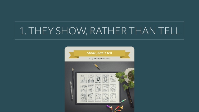 Paul Boag on how to win over your colleagues
Anton & Irene about balance on working space
Anton & Irene are 2 interaction designers who work from a studio, after breaking away from agency. They successfully shared with us the experience they gained on how to have a good work/life balance while producing creative work for both. In their presentation they preferred to show us their personal work, rather than paid projects.
Anton presented his work named misplaced buildings. What he actually did, was to take photos from famous and notable New York buildings, removed them from their surroundings and then, digitally “misplace” them into desolate, natural landscapes. Because of his architecture background, he tried to make us understand how an architectural form becomes more pronounced and easily understood if it is out of context. In the end he claimed that this project took 6 months of his personal time!
 Anton’s misplaced buildings project
On the other hand, Irene showed us a bit more “interactive” project. With Anton’s help, she created a documentary about co-living and sharing in our living environment. Initially Irene explained the process of filming. As soon as they defined the context of the project, they filmed 12 hours worth of conversations that spanned through different topics. They also interviewed 14 people and traveled 2 times to the country, where the story had taken place.
Subsequently, she refered to some important decisions they had to make in order to construct the web page. These were the scenarios of the documentary, the illustrations and the art direction.
Finally a big part of the presentation was dedicated to the poster. They wanted the homepage to feel like a movie poster. Due to the fact that Irene wrote and directed the story which was about her childhood, they wanted it to feel like if Irene was looking back in time as an adult. So they explained wonderfully how they managed, step by step, to create this cover photo with CSS animations on the home page. The documentary is called One Shared House.
 Irene’s one shared house project
Horace Dediu on “What’s Next? The Future of Mobile in Business”
A visionary, Horace is one of the world’s most respected business analysts and renowned experts on complex data analysis.
This talk had nothing to do with design or code, but we totally loved it. Horace put us on a time machine and went us back to 1800’s, in order to show us how people used to adopt new technologies, from the first telegram to cars and computing technologies. It’s quite remarkable, that smartphones were the quickest and biggest adoption in recent human history, not PC’s or cars or anything else. That’s one of main reasons why mobile business is hard to predict - because it changed so rapidly. He excellently pointed out that the more human lifespans are getting longer the less predictable technologies will be.
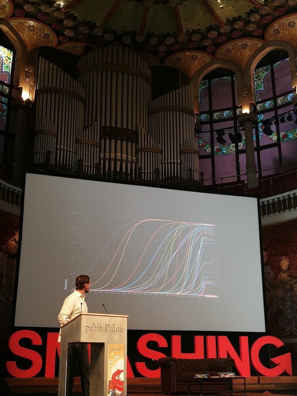 Horace Dediu during his talk
Chris Coyier on “10 Things You Can and Should Do With SVG”
Chris Coyier is a person very well known to the Front-End community. He is the creator of CSS-Tricks, a website about all things upon web-design and development. He is also co-founder of CodePen, a playground for the Front-End side of the web and co-host of a podcast called ShopTalk.
The presentation was exciting and a lot of fun to watch. He talked about SVG and showed 10 tricks a developer could do with it. Firstly, he mentioned what exactly SVG is and what you can do with it. He showed ways to manipulate graphs with SVG, morph shapes and animate them, SVG icon systems and the advantages of using them. He also described ways to produce art and graphic design using SVG. Concluding he demonstrated methods to improve design workflow with SVGs and outlined when and why to use it.
Marcy Sutton on “What’s the Deal With Testing?”
Marcy is a software engineer currently working on web accessibility tools at Deque Systems.
In her talk, she walked us through some tools and methods that can helps us test our code, mainly on the Front-End part. Tests help us sleep better at night. Testing can be found in the whole spectrum of an application, from accessibility point of view, to small reusable components and bug fixes. Unit tests for components or specific methods and intergration tests for the behaviour. There are a lot of tools under your toolbelt like frameworks (Mocha, Chai), automation tools (Gulp, Grunt) and linters(ESlint etc). A nice advice of her is, to test the outcome, not the implentation. You can succeed that using visual snapshot testing tools like Jest, Storyshots! In terms of accessibility testing, she introduced us the axe engine that audits your website and analyzes violations according to acessibility guidelines. Her quickest testing tip: Pressing your tab key and see how your app behaves.
In case we grabbed your attention you can watch her talk here.
Conclusion
Wrapping up, Smashing Conf has established itself as one of the most popular design & Front-End related conferences in Europe.
The organisation of the conference was great as well as the talks.
Despite the fact that we visited Barcelona during a period where a referendum for independence had taken place just a few days ago, it is always a very beautiful city to visit.
You can find all talks and slides of the conference here.
You are also welcome to leave a comment and see some photos below.
Photos
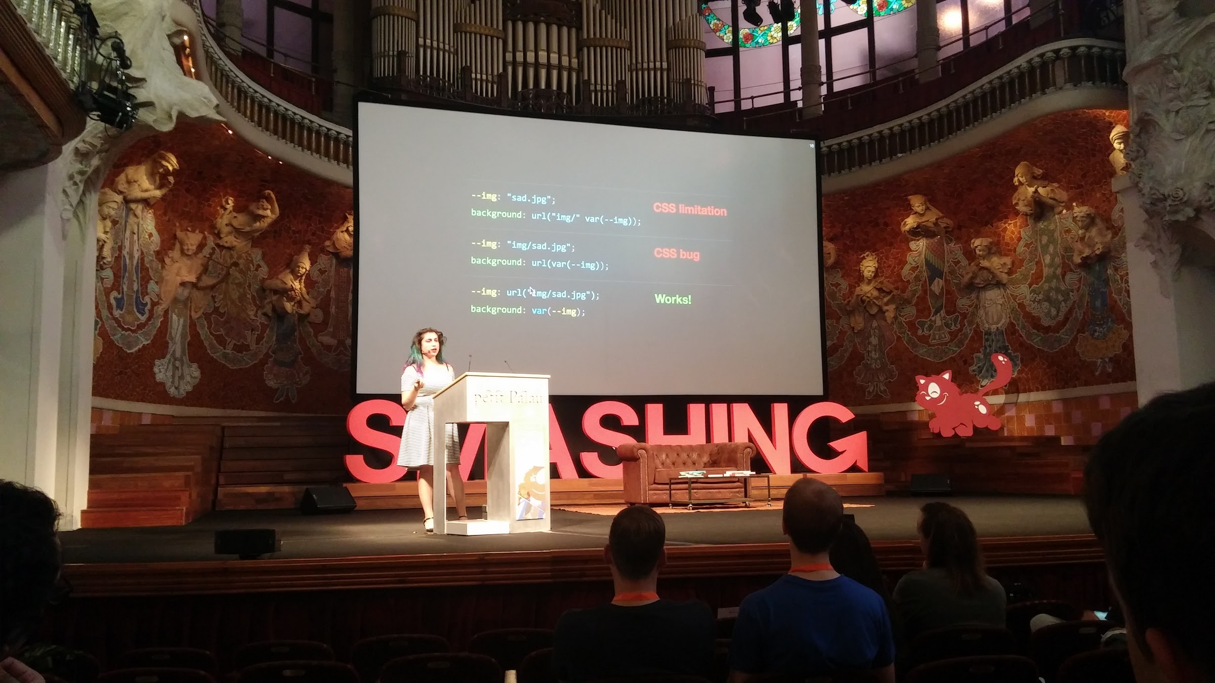 Lea Verou explains how CSS variables work.
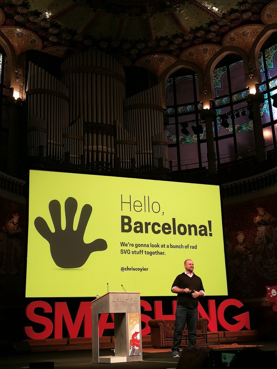 Chris Coyier begins his talk about SVG.
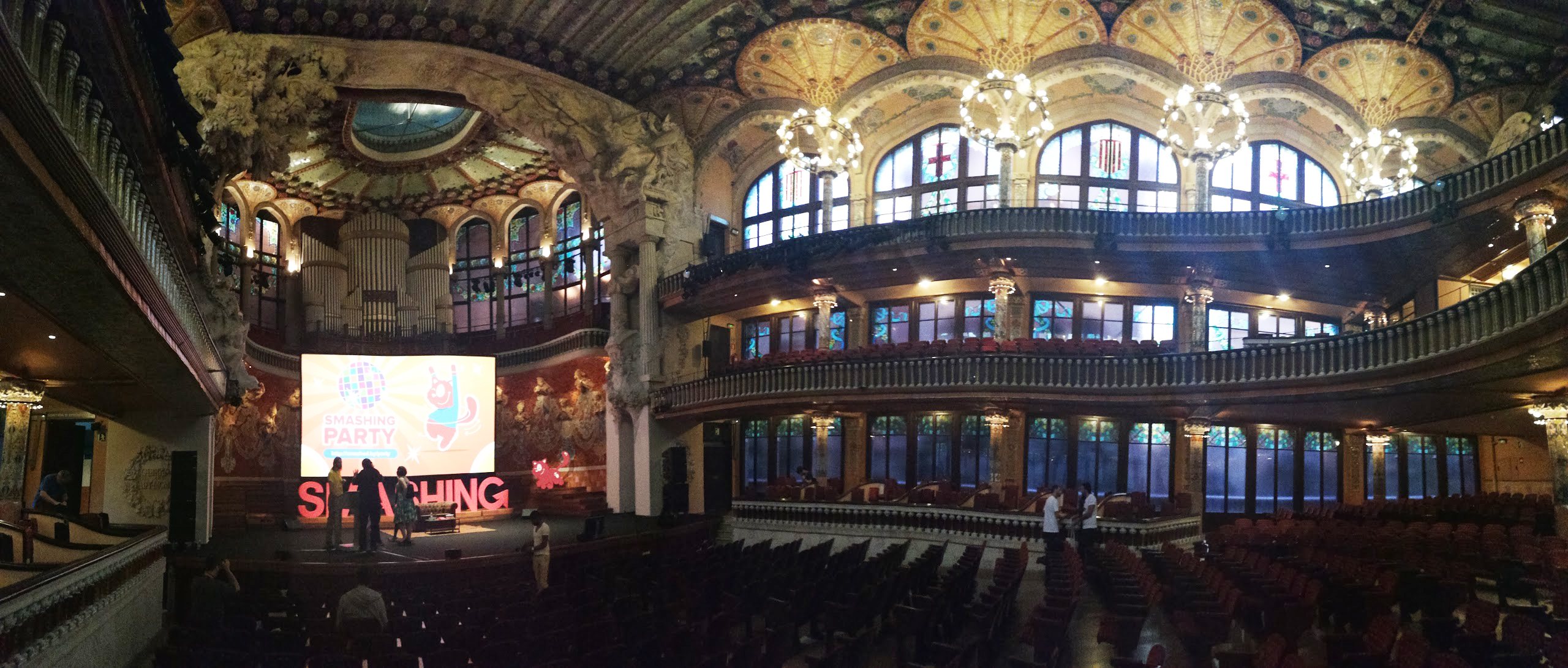 The smashing conf venue, Palau de la Música.
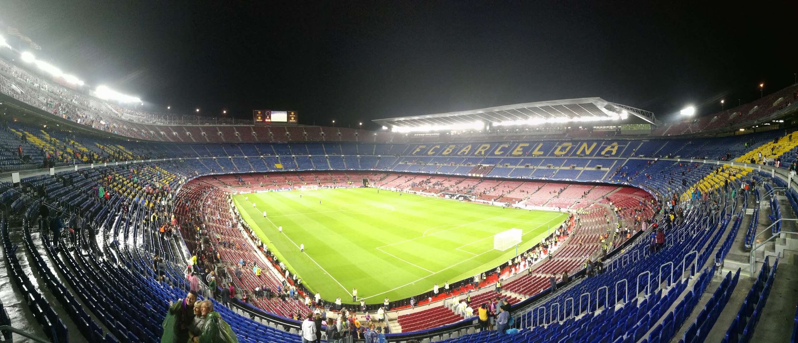 FC Barcelona’s Camp Nou.
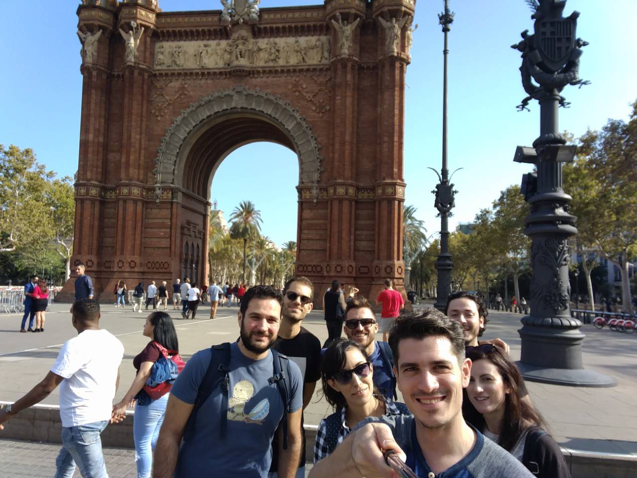 Us posing in front of Arc de Triomf - Barcelona.
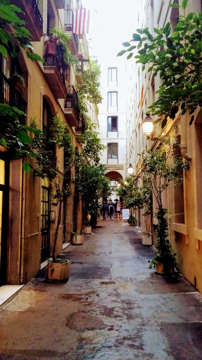 Small passage in the city center
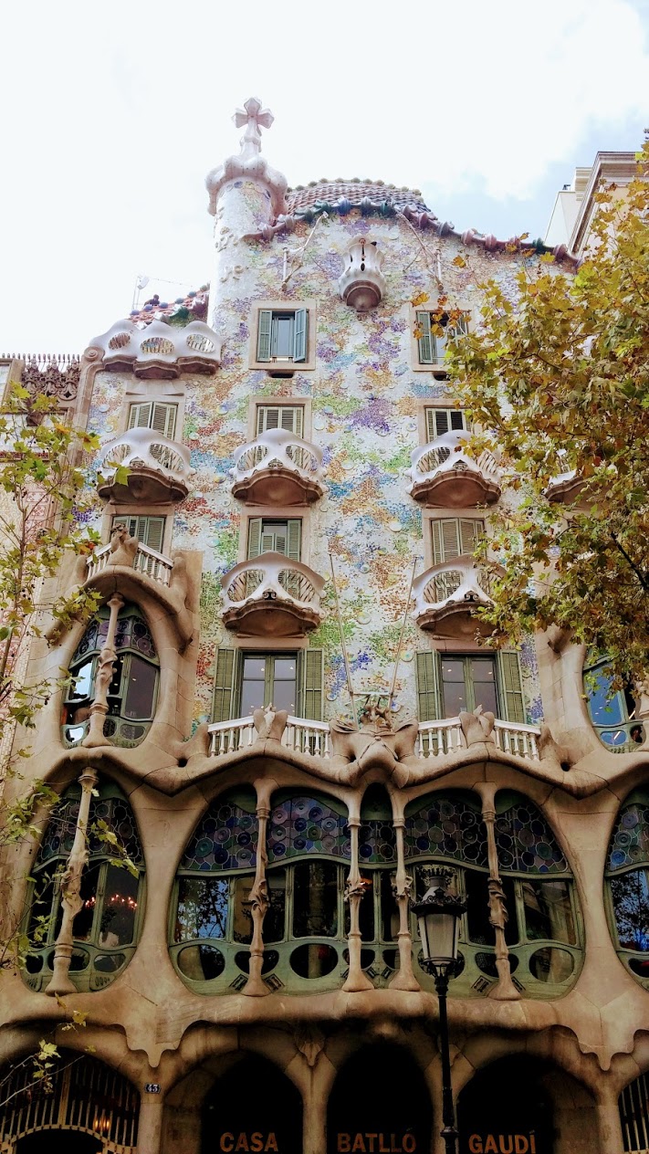 Gaudi’s Casa Batlló.
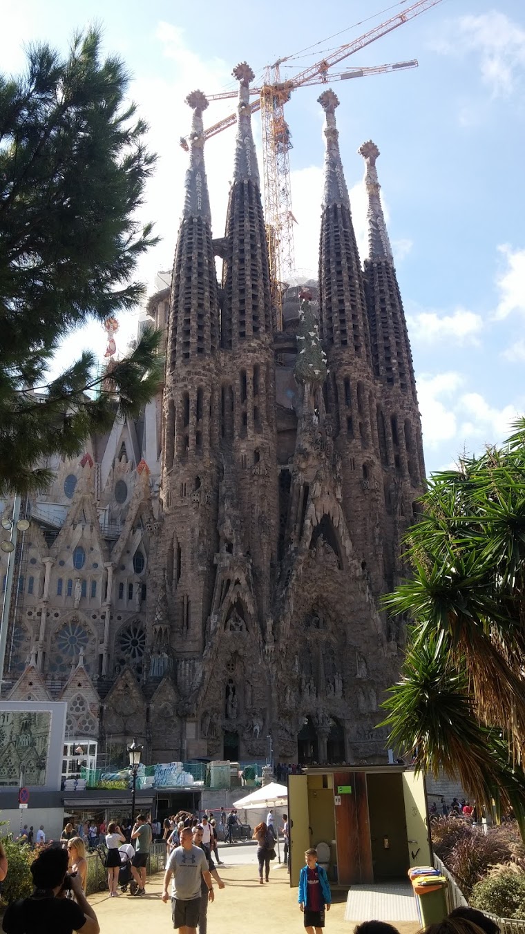 Gaudi’s Sagrada Familia.
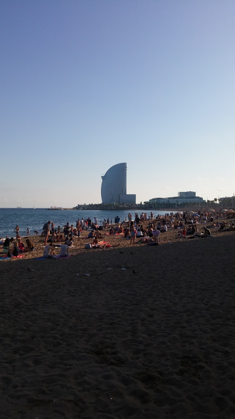 Barceloneta in the afternoon.
* Vaggelis Tzortzis, Apostolis Taxidaridis, Michael Aggelos Mpekos, Giorgos Theodorakis