#2015: An amazing front-end year at Skroutz
2015 was an amazing year for us, the designers and front-end developers of Skroutz. We evolved, designed, coded new features and stayed focused on our users and their experience.
Despite the fact that in 2015, Greece was in the middle of the economic crisis with unavoidable consequences (such as capital controls), the year leaves us, here at Skroutz with great experience, appetite and an optimistic mood for 2016!
Like every end of the year, we made both the evaluation of the previous year and the planning of the new one, and we feel happy that we can share it with you. So this year we made some great things, some of them are the following.
##Things we did in 2015
-
We launched Scrooge.co.uk for the UK, after launching Alve.com in Turkey in 2013. Through this we continued our effort to evolve our codebase, and continually expose ourselves to more advanced markets in terms of ecommerce penetration.
-
We re-organized our CSS structure, focusing on reusability and maintainability. We also continued developing our internal CSS framework, a light one, which we are working on since 2014. However we still haven’t given it an official name yet!
-
We monitored closely and improved the performance of our pages, since we pride ourselves for the sites responsiveness and overall speed.
-
We created new features, such as sorting of products based on average user review scores, the inclusion of large product image, recommendations based on other users searches, more accurate availability information and many more.
##Things we learned in 2015
Some of the things we learned during the past year will drive us for the years to come. The most important ones are:
-
With 6 million users turning to us in order to make their shopping decision, we feel the need to go the extra mile in order to validate this huge trust put upon us.
-
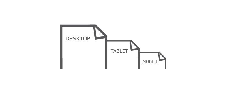
Users with mobile browsers visiting Alve.com outnumber the desktop users. In Greece the numbers are roughly the same. The mobile era is upon us, so we designed and implemented the next version of our site mobile-first!
-
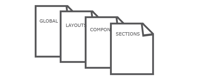
Recognising the need to focus on “design systems” rather than on designing pages, the new design focuses on reusable patterns and content specific breakpoints.
-
We like ideas introduced in Atomic Design, Scalable and Modular Architecture for CSS [SMACSS], Object Oriented CSS [OOCSS], Inverted Triangle CSS [ITCSS] and other, for our CSS architecture. We try to pick the best fitting of these upcoming ideas and integrate them into our ecosystem.
-
Bleeding edge does not mean you cannot use it in production. Flexbox is a good example of this, allowing you quick and easy wins.
-
We hold our ground in the belief that our objective is a better user experience, not technologies. To be honest though, we also like new technologies a lot. :)
##And now, 2016!
2016 will be a milestone year for us, the front-end teams of Skroutz.
We already did most of the groundwork for the new version of our site. This time we will call it “Schwartz” and it will succeed the “Helmet” version… early this year! (note that our major redesigns have names from the Spaceballs movie).
Many amazing new features will follow the new version, which will make our users able to buy what they are looking for, in a more easy and quick way!
So, let the new era of Skroutz begin! Stay tuned for more to come!
Best,
Skroutz Front-end teams.