##Short description
One of the main questions we’re regularly asking ourselves at the Skroutz UX team, is whether our website responds as our users expect and what we can change in order to help them with their buying decisions.
Our latest redesign, launched in March 2016, was an attempt to solve some UX, Design Consistency and Coding issues we had been facing for quite a long time.
Rather than designing every feature / page from scratch or using third-party design systems and frameworks, we thought that it’s better to focus our efforts on designing “the way we design”. That meant designing our own “design system”, and implementing it in a way that would make it easy for any team member to use it.
Atomic design, card-based design, content-based media queries and many more, inspired us to create our own, consistent way for solving issues.
This is how we did it.
##Why redesign?
Since our previous redesign was launched 4 years ago, lots of features have been added or discarded. Moreover, our product became international, with Alve.com in Turkey and Scrooge.co.uk in UK.
We early on recognised that staying consistent, design and code wise, would be a great challenge.
We had a good headstart from the last redesign. The codebase quality was good and over the year bugs had been ironed out. A small refactor in 2015 left us with a lightweight custom framework.
Nevertheless times had changed and what was in 2012 a starting trend - visitors from mobile devices - had now become the majority of our traffic. Also the continuous addition of features had created in some cases extremely large pages, especially for popular content on the site.
The areas we wanted to improve upon were:
- The overall UX with an eye on future developments and their smooth integration
- Design consistency through a well defined, easy to share design philosophy
- Code quality and loading behaviour
Despite the fact that these sections are independent, they form the backbone of the end-user experience.
“If I had an hour to solve a problem I’d spend 55 minutes thinking about the problem and 5 minutes thinking about solutions.”
- Albert Einstein
##Atomic Design - Cards
To build things faster, better, and easier, we needed to design and develop a robust system of components. We decided to design our design system, which would consist of typography, colors, components, layouts, conventions and clean design guides, in a way that would allow our entire team to build things fast and in a consistent way.
Atomic Design, Material Design, Card-based Design and more, inspired us in creating and implementing our own Design System.
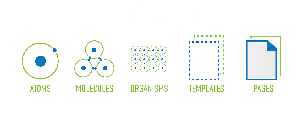
Atomic Design is a methodology for creating design systems. There are five distinct levels in atomic design:
- Atoms
- Molecules
- Organisms
- Templates (or objects)
- Pages
Source: bluefountainmedia.com
In a system like this, that borrows its terms from chemistry, an atom is the minimum building block of matter, meaning that it can’t be broken down any further. Our atoms are buttons, form elements, fonts etc. Molecules are groups of atoms bonded together, so for example the pagination list or the rating block are some of our molecules. A group of molecules form an organism, which is a distinct section· like our filters group. Templates, or objects comprised of organisms combine together to form page-level objects, and finally, pages are instances of objects, organisms and molecules.
Once we defined what is an atom, a molecule, an organism, an object and a page, we were able to include it in a system and create a solid ground for every team member to create whatever he or she can imagine, in a sane and consistent way!
For the user interface, the card paradigm first introduced on a large scale via Google’s Material Design was our starting point. A Card-based design is not a magic bullet for perfect usability but for us it seemed to provide context, an entry point to more robust information and views, and its content and quantity can vary greatly.
Various content 'sits' on the same container: a card
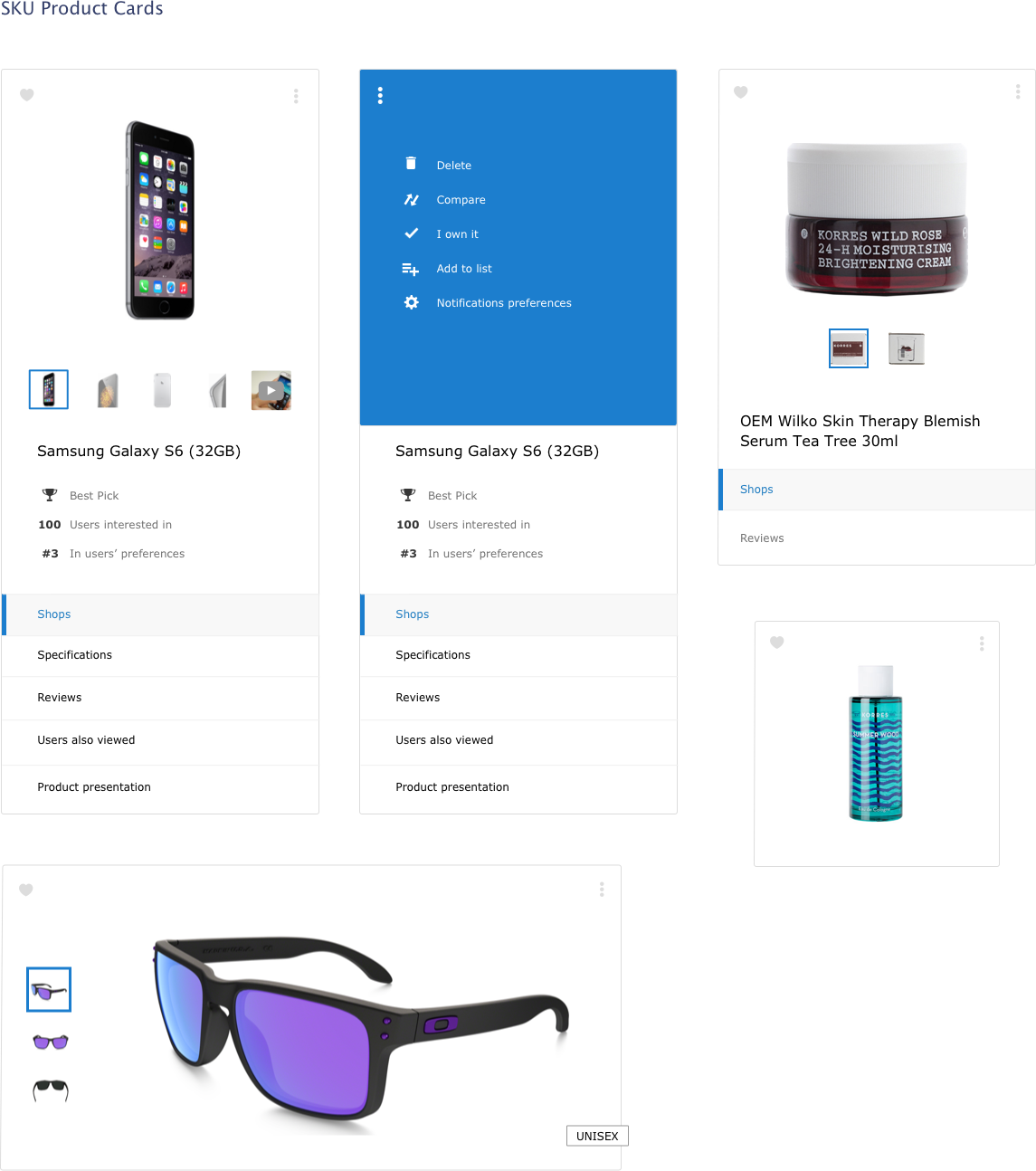
Cards provide the user a consistent experience improving trust, learnability, and therefore usability. Furthemore, they are easy for users to scan, digest content, and finally click the area of interest.
We expanded the Card-based design interface by creating guides about the information density inside the cards. Specifically, we created rules about how narrow or wide a card could be based on its content. That is how we created our Content-based adaptive Card UI.
##Front-End implementation
Having had recently refactored our CSS, we knew what we had to do to improve it. Also we already followed an internal styleguide. For the HTML we had to do targeted improvements in terms of simplification and modernization. Finally basic JS functionality would remain the same, at least for the start.
####CSS
Skroutz (and its fellows Alve.com and Scrooge.co.uk) is a large scale application. Large-scale applications have to deal with issues like naming things, code bloat, dependencies and reusability, unused code paths and many more.
“There are only two hard things in Computer Science: cache invalidation and naming things.”
- Phil Karlton
Our CSS architecture, although responsive, was desktop-first, that means that a mobile browser had to download and compute all CSS -even the useless desktop styles- before before rendering the first frame. This may not be critical for many sites but it was for us, since most of our visitors come from a mobile device. So we had to switch our CSS to be mobile-first in order to improve application’s performance.
We deleted our old CSS. 29.410 lines of code dropped in a single commit. Then, we created the atomic’s approach file architecture and wrote the atoms, molecules, objects and pages, iterating over it in order to improve it.
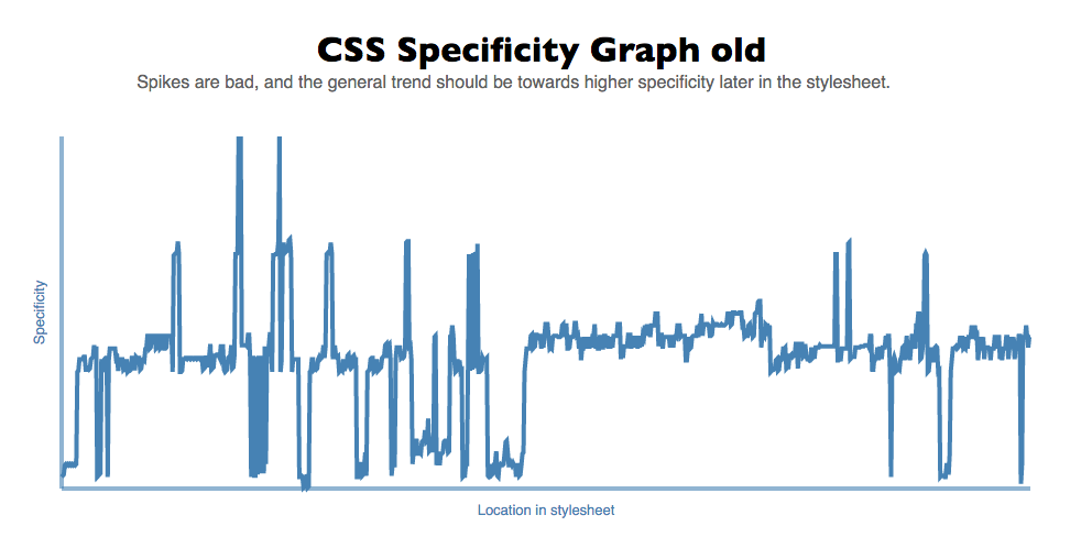
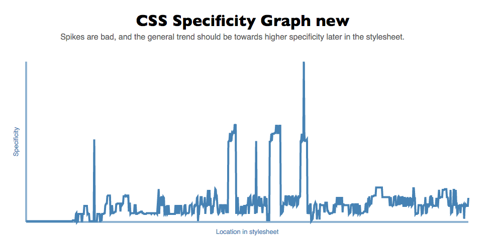
The results were more than good, we decrease our total CSS size from 100.4kb to 45.9kb Gzipped (-54%). For mobiles, we load now 32.5kb Gzipped instead of 52.2kb for our most popular sections and the specificity graph showed improvements as well:
CSS specificity graphs before (up) and after (down), as exported from Specificity graph generator: as images mention, spikes are bad and the general trend should be towards higher specificity later in the stylesheets
CSS partials bundle, gzip and serve in 3 main files (our codebase version names come from the Spaceballs Movie, previous version was named Helmet, current one is the Schwartz. ):
- schwartz.css
- schwartz_medium.css
- schwartz_large.css
To reduce load, we have some more bundles for logged-in users, and other more autonomous (both visually and functionally) sections.
Written this way, CSS is now mobile first and based on Atomic architecture. This results in:
- Better rendering and painting performance, especially for mobiles
- Easier and faster feature development
- Consistent, better user experience
- Structural, easier to maintain, edit & extend CSS
####Content-based adaptive card breakpoints - Element Queries
Responsive web design has become a household term since it was coined by Ethan Marcotte on A List Apart in 2010. Responsive sites change appearance based on the browser environment they are being viewed on (the most common thing: the browser’s width).
In the very beginning of the responsive websites era, breakpoints definition was based on specific devices, products, brand names etc.
Source: youdedicated.com
Since then a lot has changed: with the ever growing number of different mobiles, tablets, watches and whatever else communicates information visually, those device-specific breakpoints were rapidly outdated. Instead, the content itself must impose how the layout adjusts to its container. A breakpoint should be added when the content is no longer easy to consume.
For the new Skroutz, we started small, then worked up. We designed our most important element (that is a product card) to fit on a small screen size first, then we expanded the space until a breakpoint becomes necessary. This allowed us to define breakpoints based on content and to have the fewest number of breakpoints possible.
So far so good, we defined product card minimum and maximum widths based on the content, and the deriving major breakpoints in one page. Unfortunately we have many pages with different layouts and we wanted an easy way to apply these rules wherever we have to.
This wasn’t so simple.
For this to be done we had to use something like “Element Query”, that is a Media Query but for the parent element, rather than the viewport. This way, we could create a “component” that is styled one way when it’s in a narrow container, but another way when it’s got some breathing room. It just naturally happens due to the width of the respective containers.
As Tab Atkins (Google Chrome) states, the first and most obvious problem with Element Queries is circularity, and even if we avoid circularity, they have further issues in implementation. So we had to find a way to define positioning of the cards.
That’s where Sass Mixins came into play: we wrote a mixin for the card items to position themselves depending on 2 main params:
- on the viewport width
- on the number of the elements every row should have
Apart from these, an optional param determines whether or not the items should break into multiple lines.
// Element Query

@mixin minisku-element-query($viewport, $items_per_line, $break_lines: false) {

  @media (min-width: #{$viewport}) {

    $item_percentage: percentage(1 / $items_per_line);
    $extra_gutter: 20 * (($items_per_line - 1) / $items_per_line);

    > li {
      width: calc(#{$item_percentage} - #{$extra_gutter}px);
      float: left;
    }

    > li:nth-child(n) { // Cancel float clearance
      clear: none;
      margin: 0 20px 20px 0;
    }

    @if $break_lines == true {

      > li:nth-child(#{$items_per_line}n) {
        margin-right: 0;
      }

      > li:nth-child(#{$items_per_line}n+1) {
        clear: both;
      }
    }

    @else {
      display: block;
      font-size: 0;
      white-space: nowrap;

      > li {
        display: inline-block;
        vertical-align: top;
        float: none;
        font-size: initial;
        white-space: initial;
      }
    }
  }
}
You can see the mixin in action in the following Codepen:
See the Pen xVMyvy by katsampukas (@katsampukas) on CodePen.
This way, we can set the desired appearance in every list, we only have to do some calculations about the list’s container and how we want to align every item in the list.
Although this is not an Element Query, it helps us to emulate the desired behavior and it works really nice!
####HTML
Our HTML was already in a pretty good state. We knew we had some parts to improve, for example we decided to use modern HTML5 tags like header, footer, nav, section and more.
Nevertheless, the biggest problem of the HTML was the really huge DOM in some of our most popular pages, which contain a lot of user-generated content, like reviews.
The huge DOM was causing crashes due to memory restrictions, while at the same time performance was poor in terms of rendering and painting.
To solve this, we loaded by default a sufficient amount of new user-generated content and there is an ajax request, if the user wants to see older content.
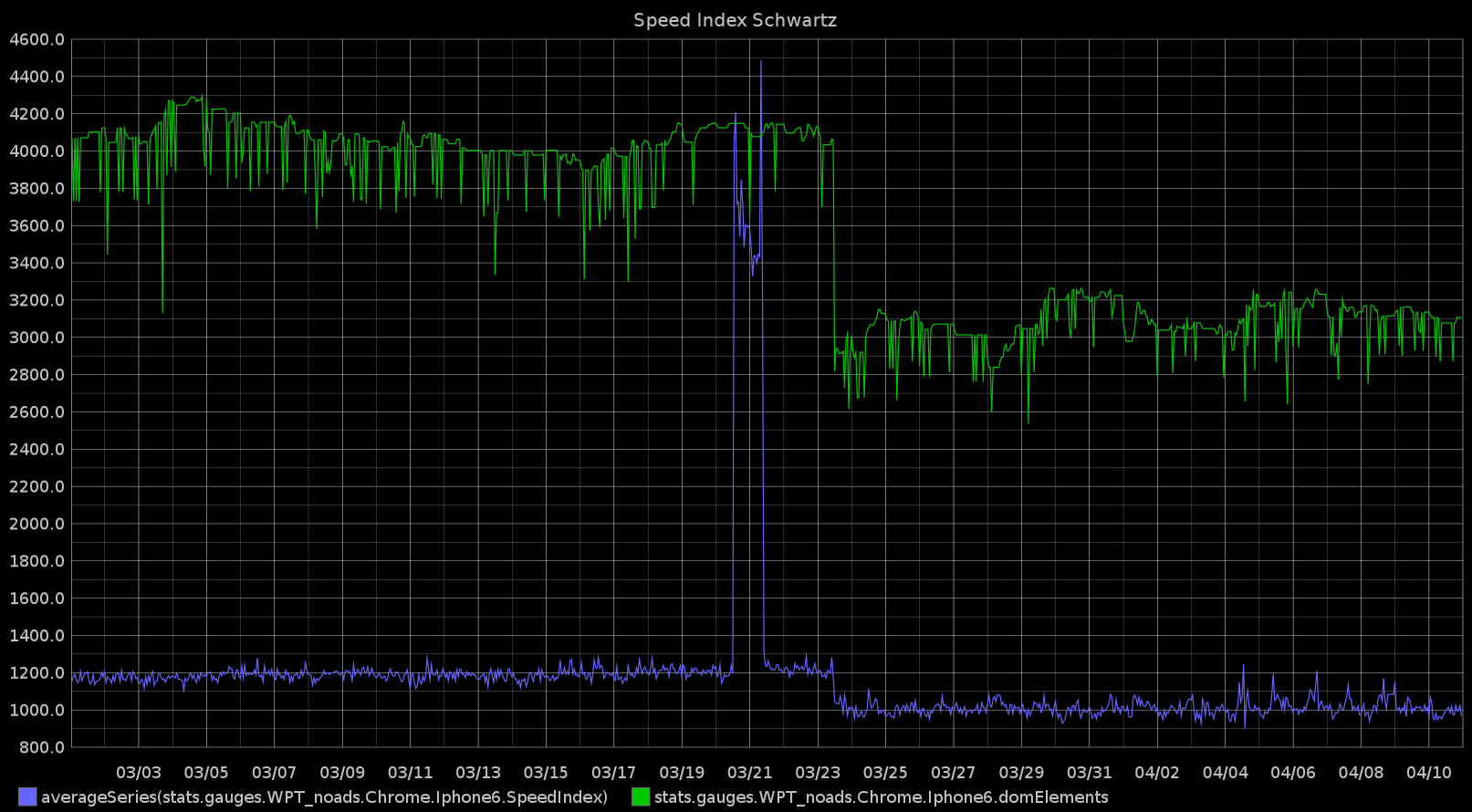
This results in better performance as the Speed Index and DOM elements graphs of some heavy pages shows:
Speed Index and DOM elements decreased in popular pages after redesign's deploy
Furthermore, we already handled such issues server-side, with caching layers, gzip, bundle files etc.
####Testing the results
Of course, this was just the beginning. Once we launched the redesigned site, we started to test it, in order to understand how the users interacts with it. Our intention is to find and remove barriers between the users and his goals and understand their motivations so we can provide them a better experience.
For this, we use UX tools like A/B testing, heatmaps, scrollmaps, conversion funnels and more.
##What’s next
While the redesign targeted some specific areas we wanted to improve many more are on our lists. Some of our future tasks will be:
- HTTP/2
- Images optimization (e.g. picture tag)
- Continuous refactoring
- New features
- Continuously improving User Experience
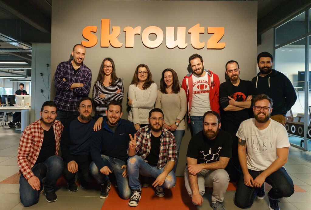
Skroutz Front-End teams take a photo after Schwartz release
We hope you got some value from the way we approached our own design system. Or maybe you have a question about it.
Either way, let us know by leaving a quick comment below.
Best,
Skroutz Front-End & UX teams.